Project Description
Title: FITTED
Role: solo UI designer
Responsibilities:
UX design, research and analysis, UI app design, data visualization and animation, prototype and testing, preparation of handoff
Time frame: 2 months
Tools: Figma

Context
The project was a part of the UI for UX designers course in CareerFoundry.
Among 4 different project briefs, one stood out for me; the FITTED workout app.
As someone who values a healthy lifestyle and feels like a good workout can be really grounding and spiritually refreshing, I was drawn to the objective of the brief and had a lot of ideas already rushing in my mind. I couldn’t wait to start.
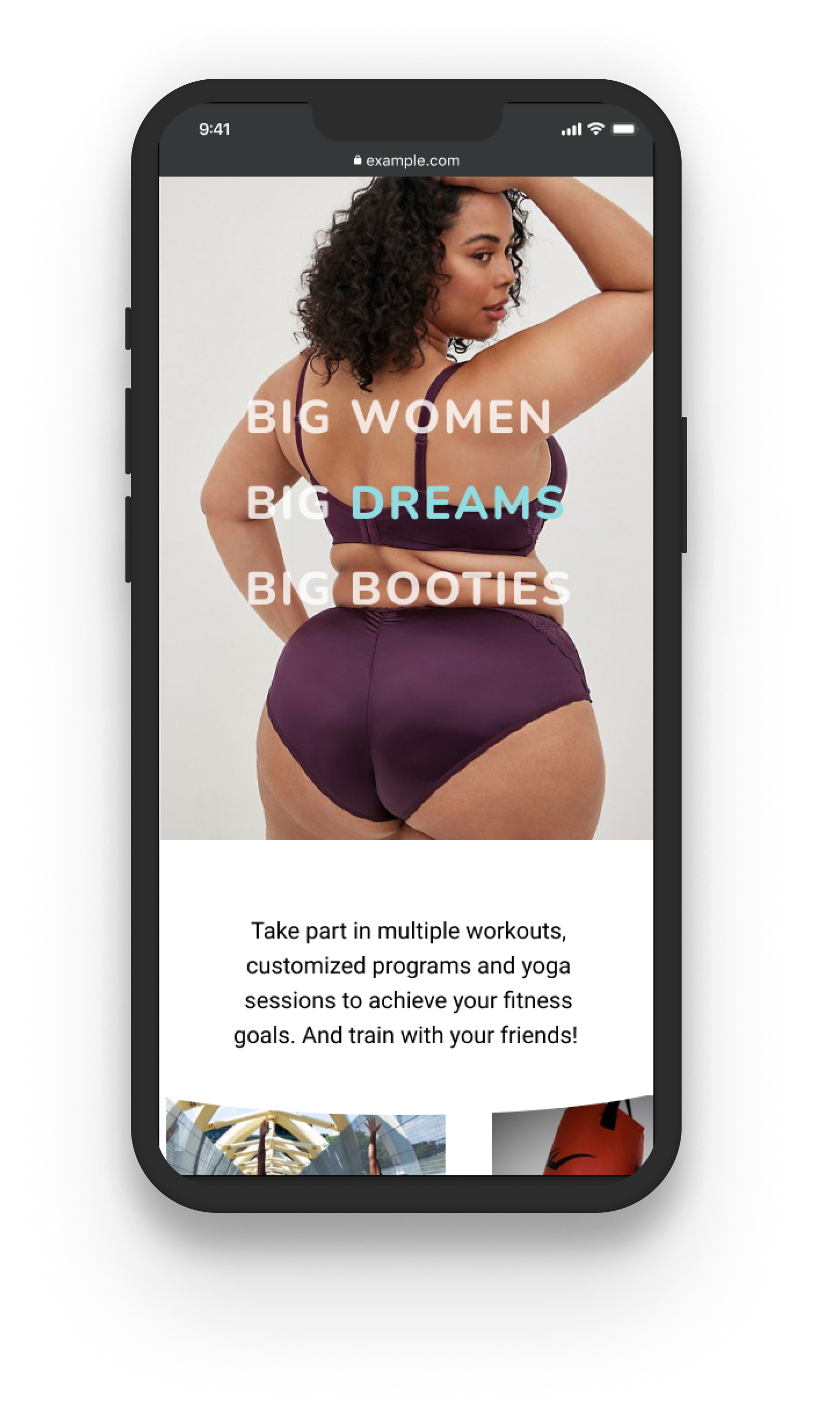
The message I want to send is that FITTED is all about working out mindfully.
It is here to create a place for you to feel inspired, fresh and strong.
My own Goals
Fit in as little as a 5-minute routine
Find workout plans for your fitness level
Educating, personalized and easy-to-follow
Find workout plans for your fitness level
Educating, personalized and easy-to-follow
My Challenges
Crunch time: 2 months
Create data visualization
Start from the middle of UX process
Personal challenge to reach a higher standard in my designs
Create data visualization
Start from the middle of UX process
Personal challenge to reach a higher standard in my designs
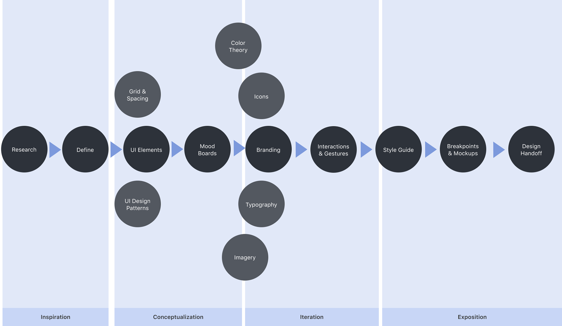
Design Process
I attempted to summarize my design process in this graph to show how my deliverables were structured and how I understood the order of the tasks as a UX designer.
It should be expressed that the process is never completely linear, that being said, the use of these steps as a general guideline for taking a product from conception to implementation will help ensure that the produce is a well-designed, user-centered product or service.
Understanding the User

FITTED Persona
Rebecca
Rebecca's Goals:
- wants to lose weight and get in shape
- fit exercise routines into her busy schedule.
- learn how to properly exercise.
- find short exercises that she can do multiple times per day
- fit exercise routines into her busy schedule.
- learn how to properly exercise.
- find short exercises that she can do multiple times per day
Challenges:
- Lose weight and stay motivated
- Beginner to working out
- Has a busy schedule
- Beginner to working out
- Has a busy schedule
“I love the thought of having something that could really work with my schedule. Being as busy as I am makes it tough to exercise otherwise.”
Benchmark Insight
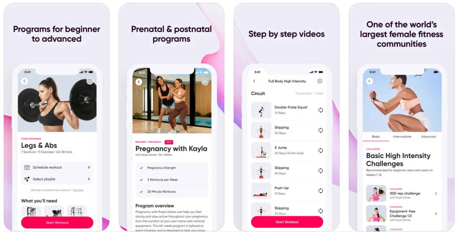
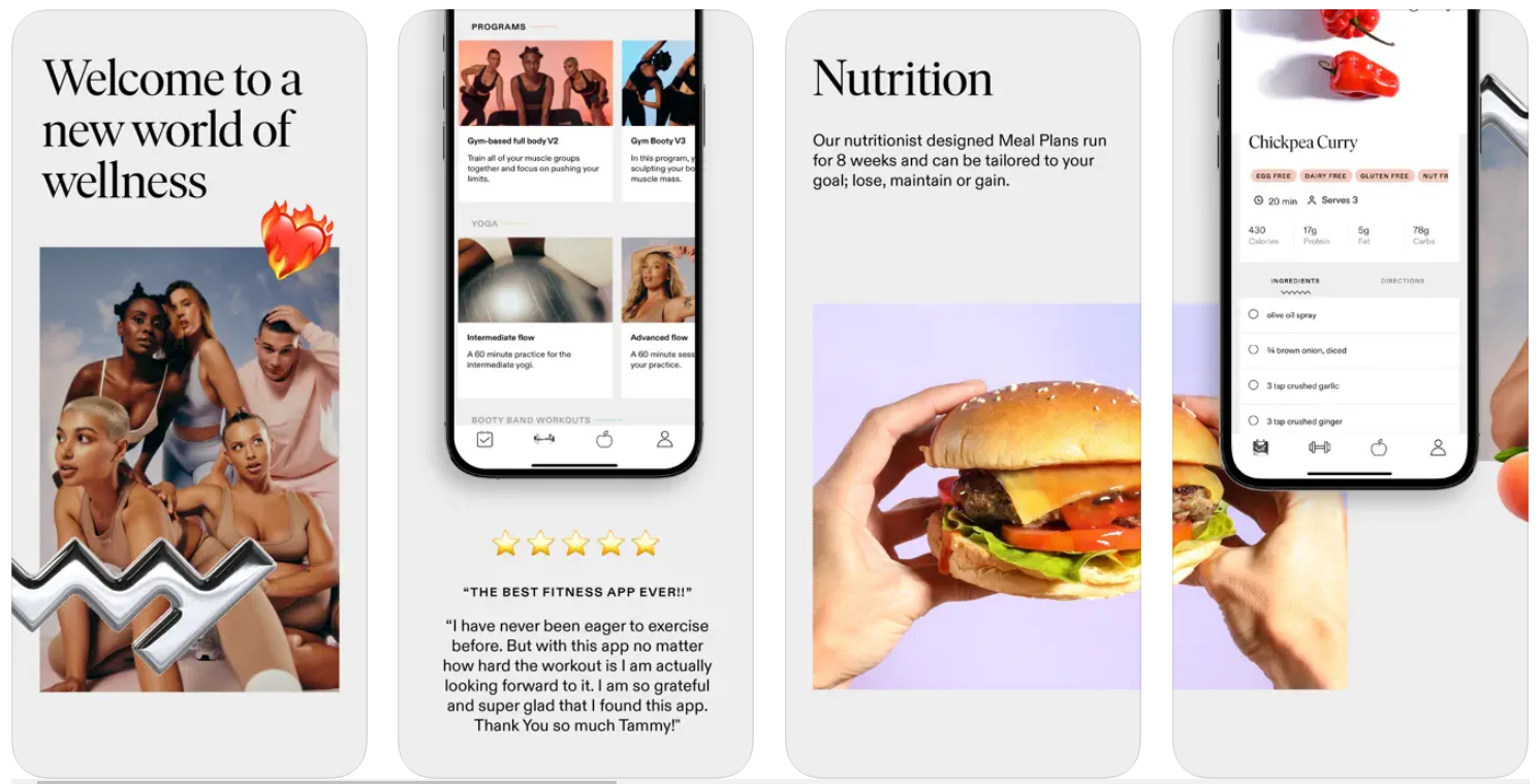
I reviewed the UI elements of four fitness apps, especially focusing on SWEAT and TAMMY fitness applications, collecting insight on user flows, typography, color pallets and interactions.
SWEAT
by Kayla Itsenis
TAMMY
by Tammy Hembrow

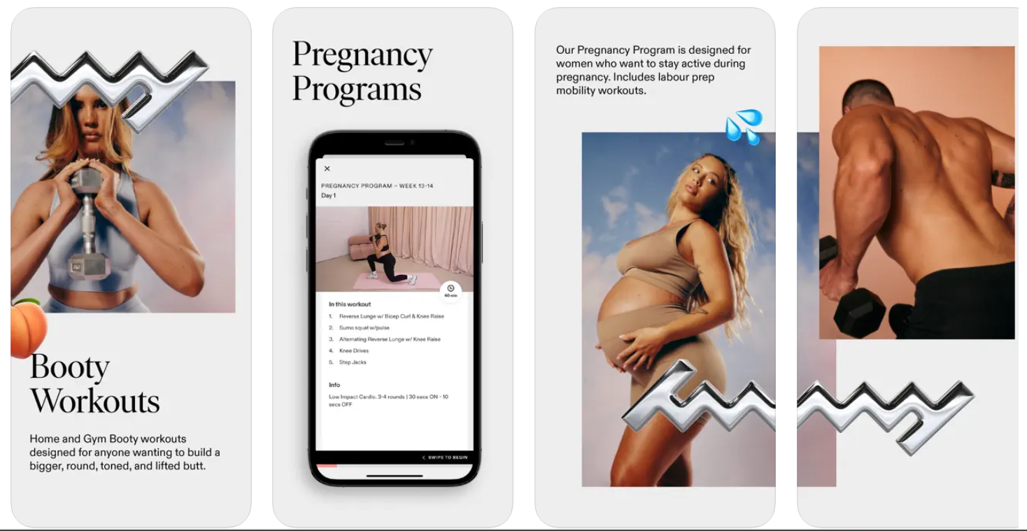
Conclusions:
Create simple page layout that focuses on showcasing workout options, use sideway scrolls and carousels, take the opportunity to design a creative calendar and workout schedule. Offer easy to access CTA’s to go through the app. Add reward badges that reflect their level and personal encouraging words.
I learned that when you make something specific it tends to be more universal.
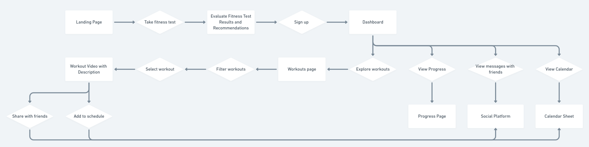
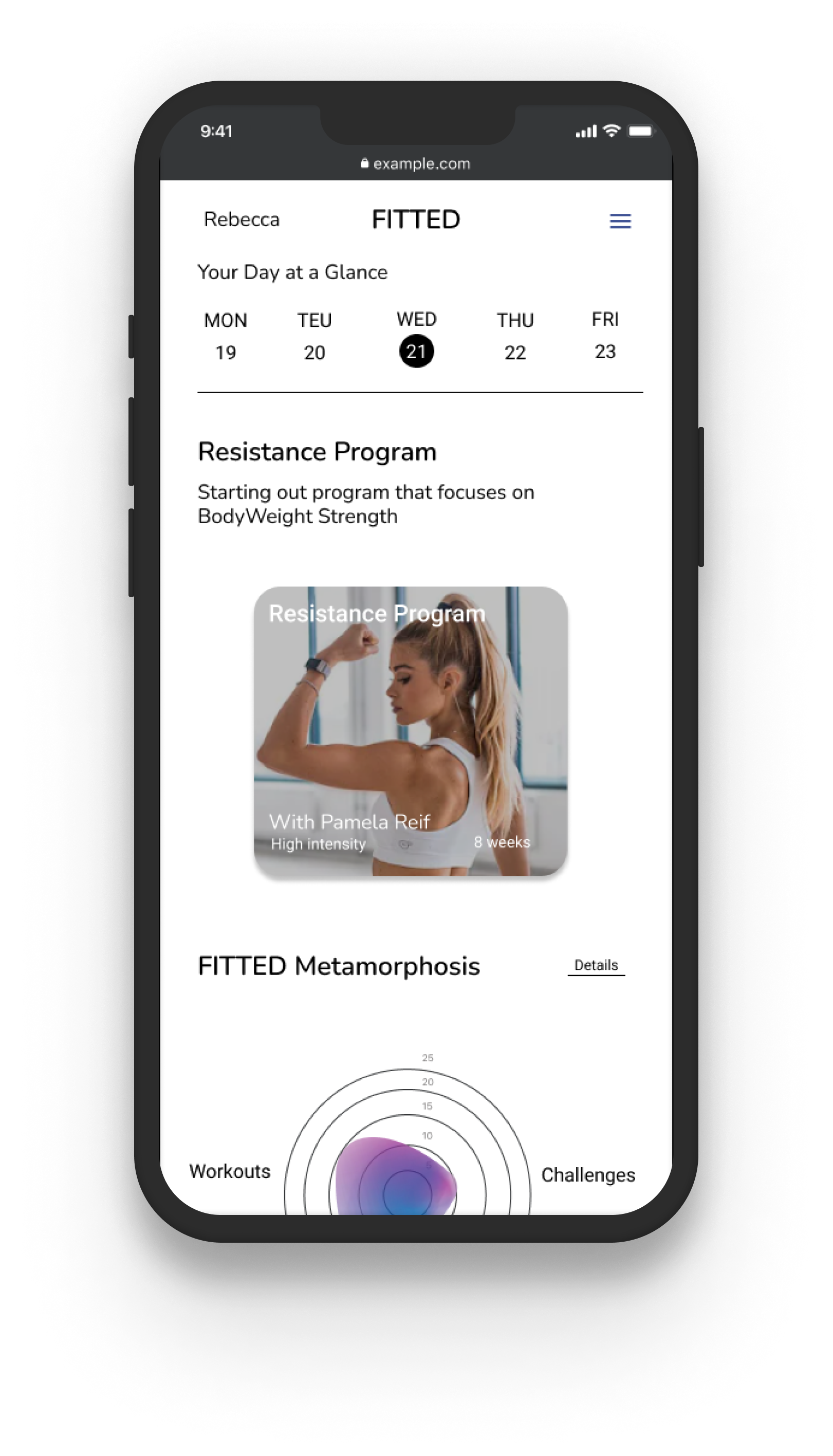
FITTED User Flow
After understanding what potential users may need and how others have approached the solution, I designed the user flow for FITTED app to understand how the user will interact with the app.
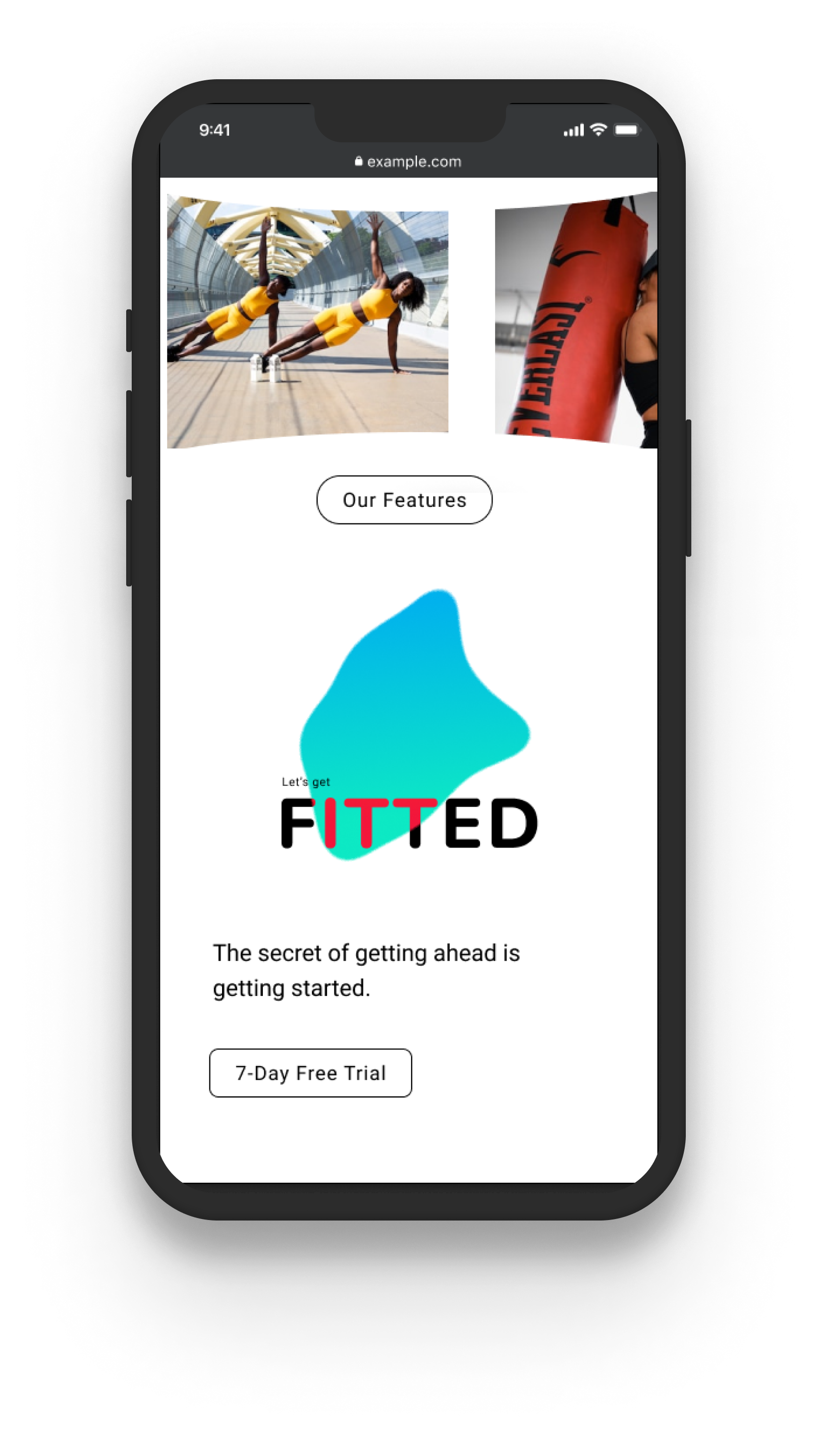
Begins at landing page where the user can find out more about the app feature with teaser images and descriptions with a link to take the fitness test, sign up and use the personalized dashboard that they can re-enter to every time they log in
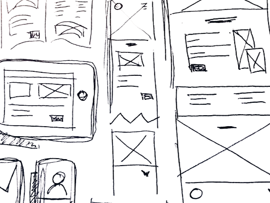
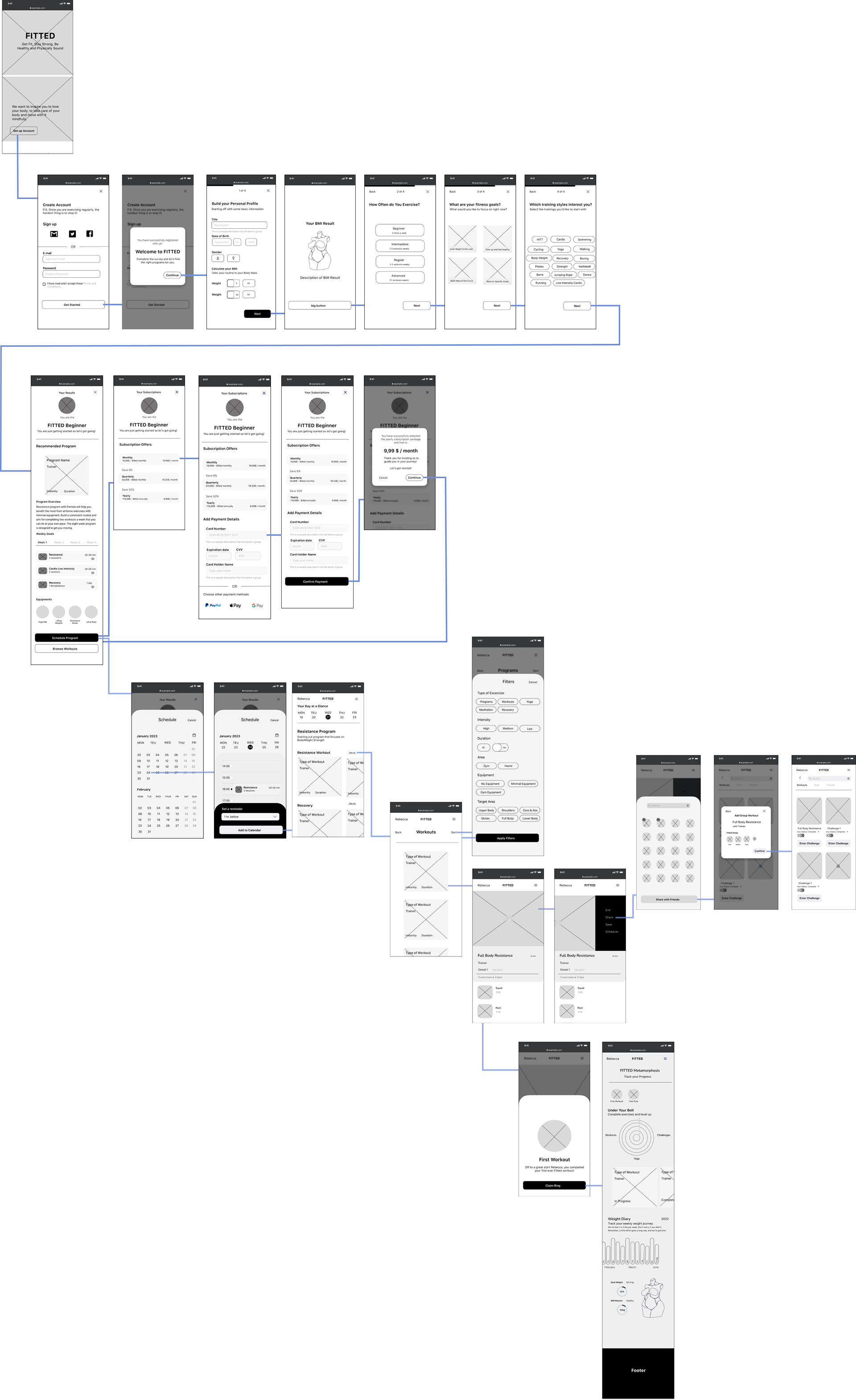
Mid-Fidelity Wireframes
Instead of making paper sketch drafts, I went straight to digital wireframing on Figma.
This way, I was able to skip the low-fidelity wireframes and create a prototype to test with users. It was a quick way to see if the design was any good before moving on.
Design Direction
On top of catering to the user’s need to find the right workout I wanted to tap into a deeper emotion within them.
Working out is not only about losing weight or gaining muscle, it is also about confronting yourself and challenges how you see yourself.
With this in mind, I wanted to create a space to inspire the women who will use this app to keep challenging themselves and somehow communicate to them that this space is made for them.
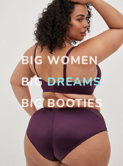
Mood Board Collection
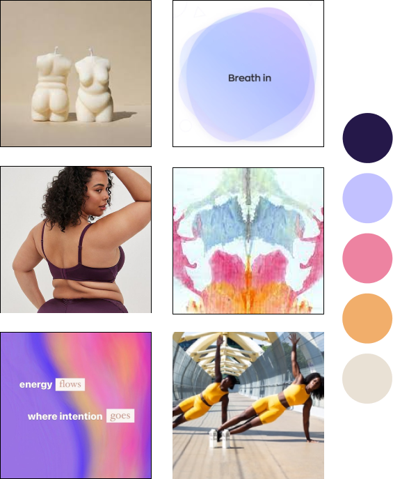
My aim was to develop a visual identity that aligns with the brand's core values and messaging. So I started collecting mindful, inclusive and body positive imagery.
I found inspiration from:
- Body positive candle designs
- Rorschach inkblot art
- Gradient colors
- Encouraging messages
- Empowering Representation
- Rorschach inkblot art
- Gradient colors
- Encouraging messages
- Empowering Representation
Design Re-Iterations
I knew I needed to re-design but I didn’t know how to start. To do that I conducted several usability tests to guide me to a more user-centered re-design.
As a result there were four major improvements in my redesign.
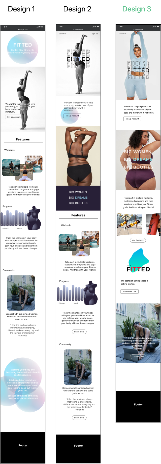
The landing page
It was initially designed to showcase all the features of the app, including a short message of what we aim to do and a link to set up an account.
The app’s re-iterations slowly transformed the design that focuses on the message of the app. Through the re-design based on exploring different color schemes, my app’s mission became even closer to the persona’s needs.
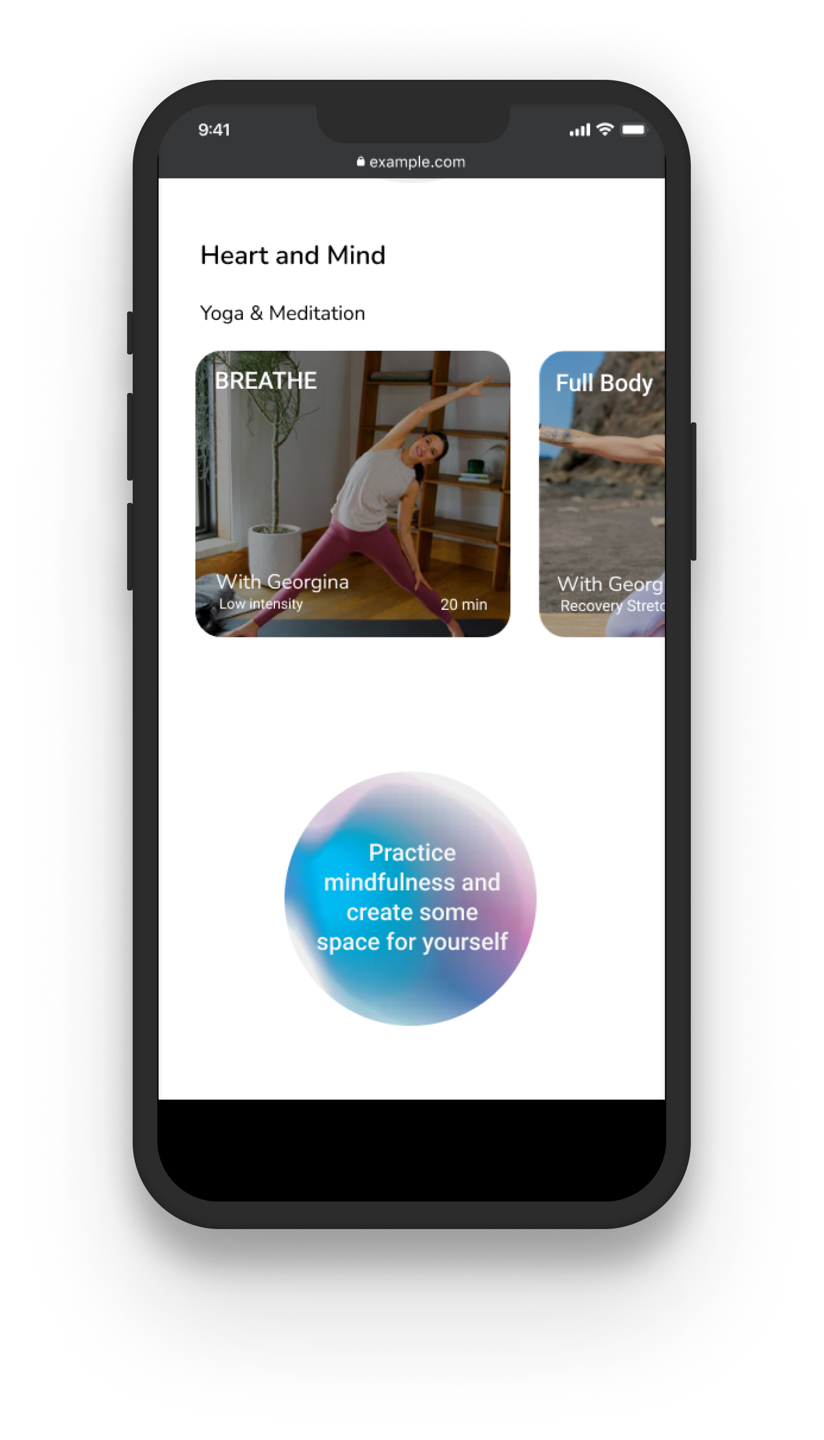
The Home Page
Color and design of app is too distracting. Too many elements crashing against each other. The app’s initial idea to help promote fitness and guide the user to find the right workouts is lost.
The question asked here: is it the color pallete that is the problem? or the app’s design?
a complete re-design of the app’s information architecture is necessary and use gradient colors and blobs more organically in the design.
The question asked here: is it the color pallete that is the problem? or the app’s design?
a complete re-design of the app’s information architecture is necessary and use gradient colors and blobs more organically in the design.


The Progress Page
The first 2 designs followed the muscle diagram inspiration that promotes a more body positive image and the chakra color palette to distinguish different body parts and muscle groups.
The illustration details the body parts the person worked on in that day and the workouts they completed.
As n the examples before, the colors were clashing and the design was not as intuitive as I previously intended.
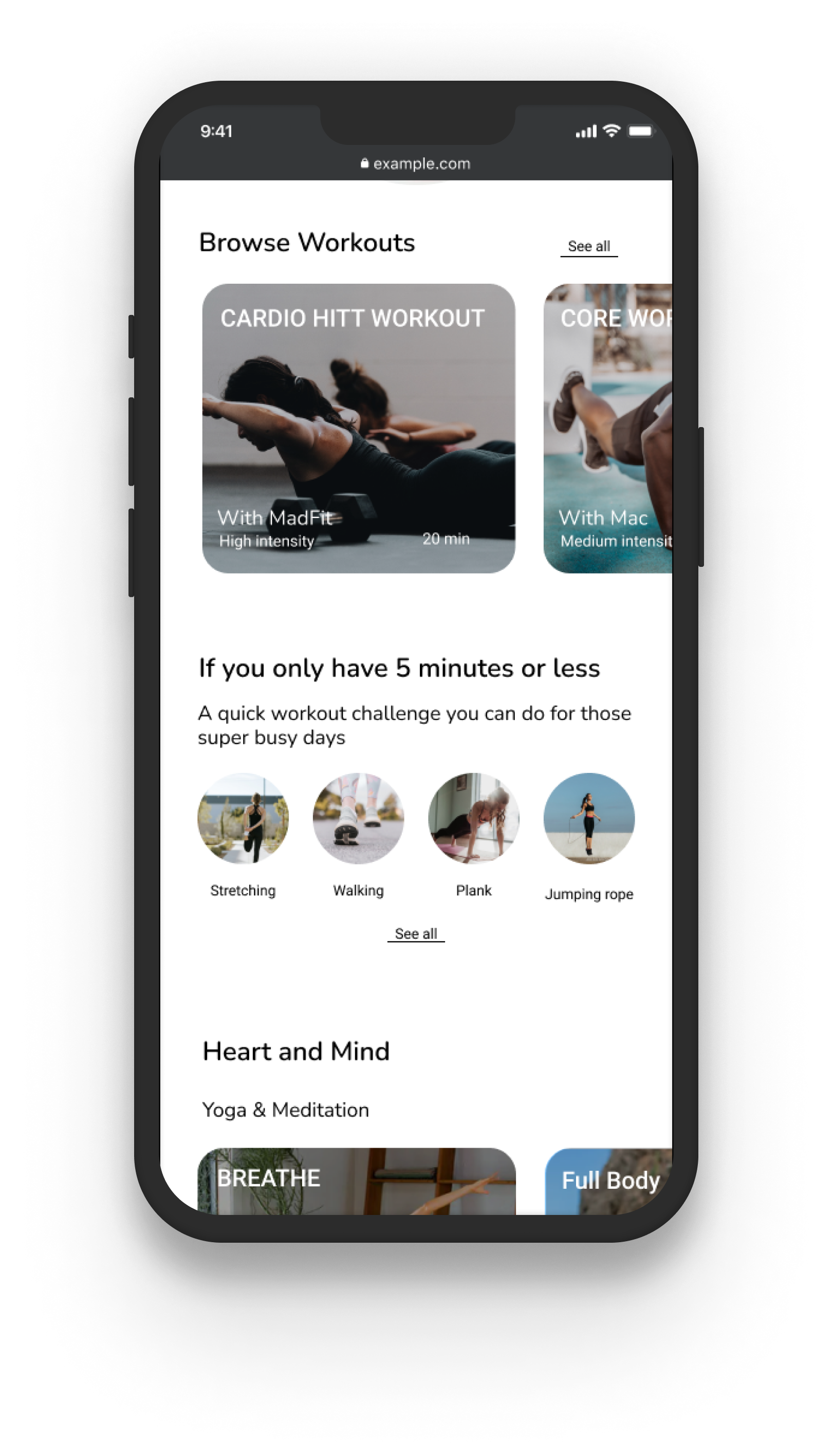
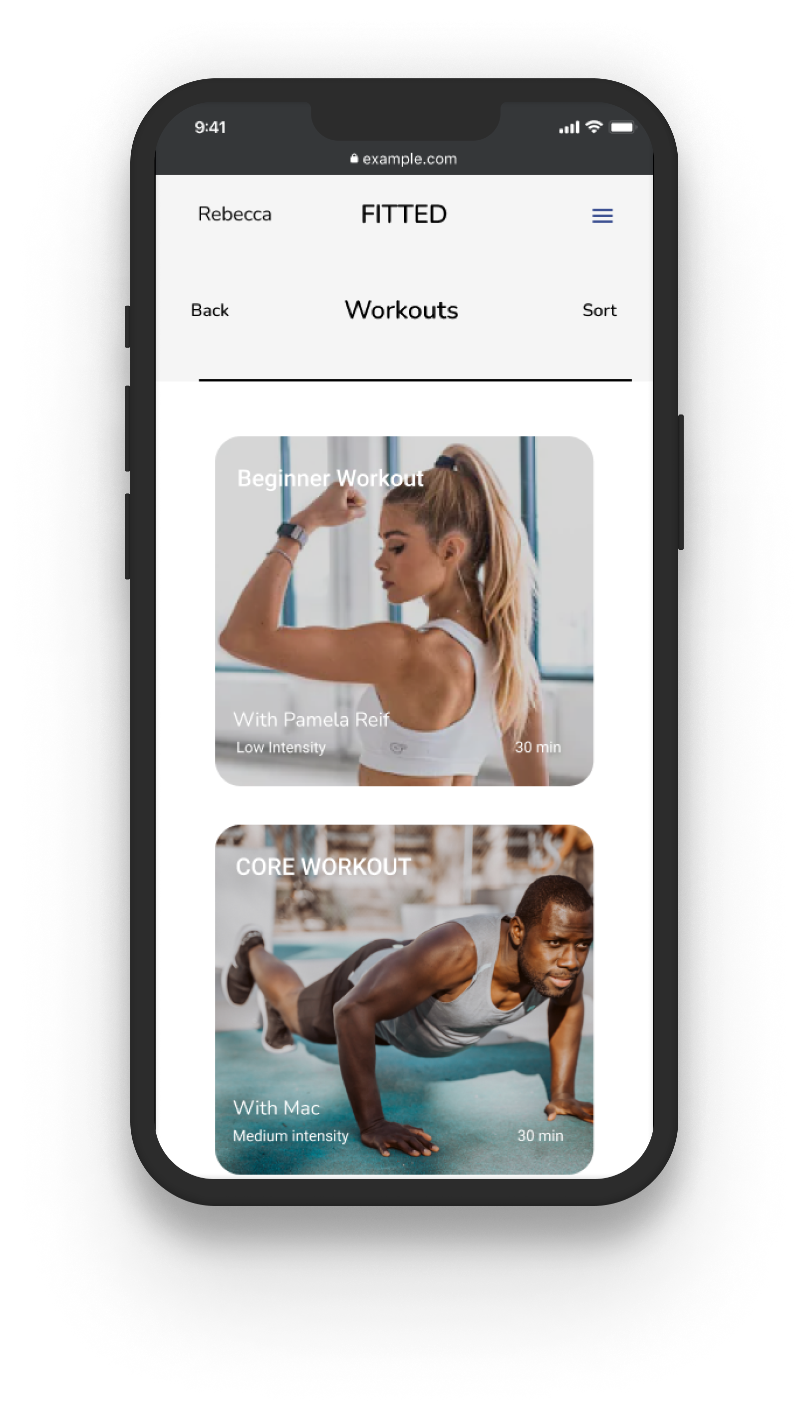
Filtering and searching for workouts
It was initially highlighting the filter selection where users can move the curser around to define the intensity and duration of the workout. The first 4 designs followed the same architecture but with different color schemes.
It still looked too distracting and the workout cards themselves are too small.

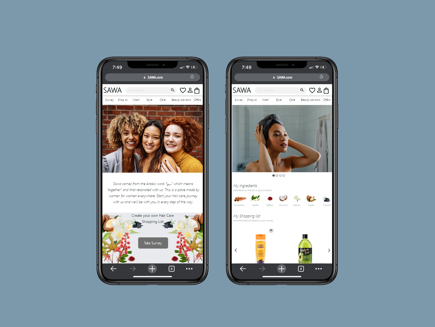
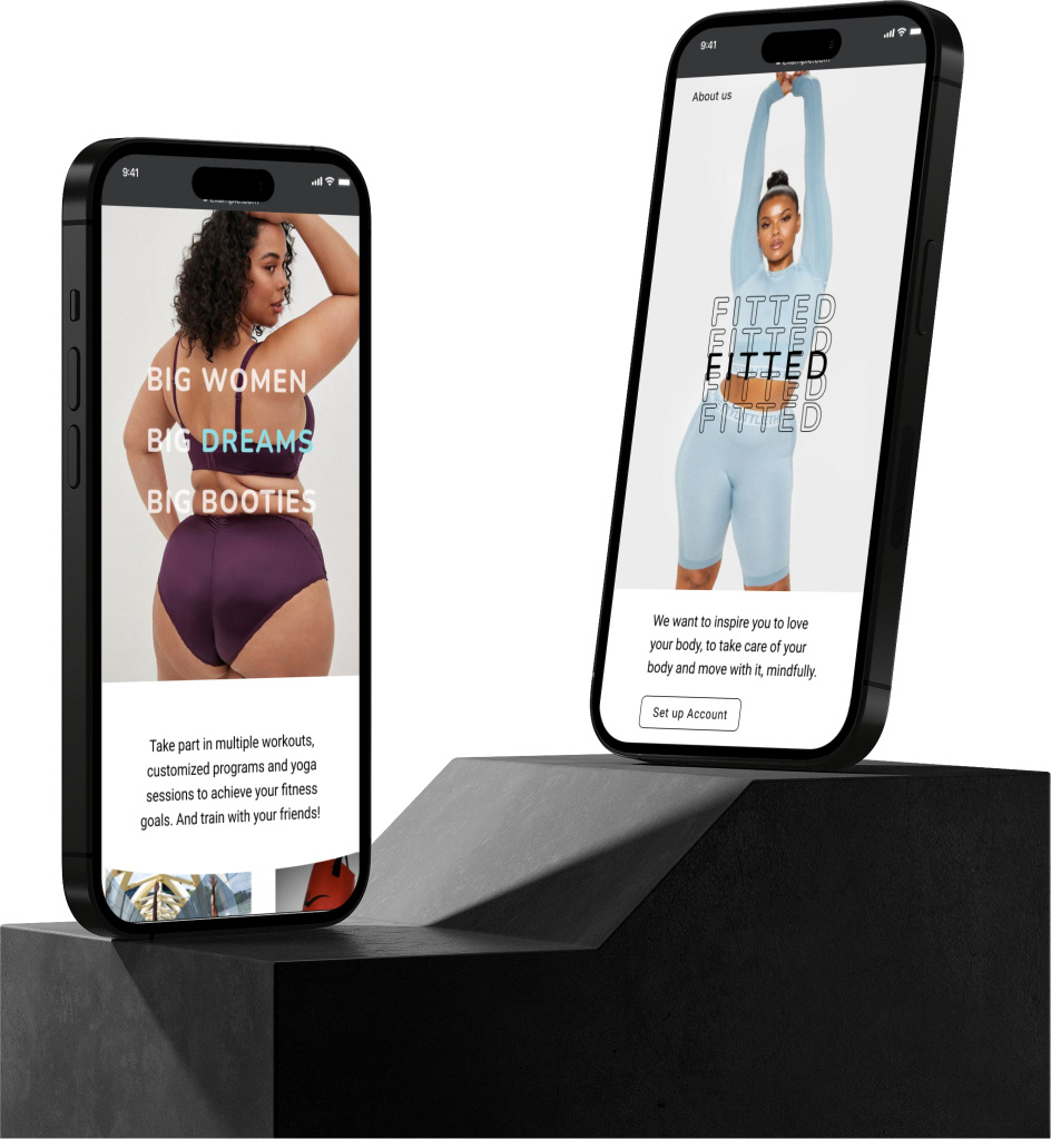
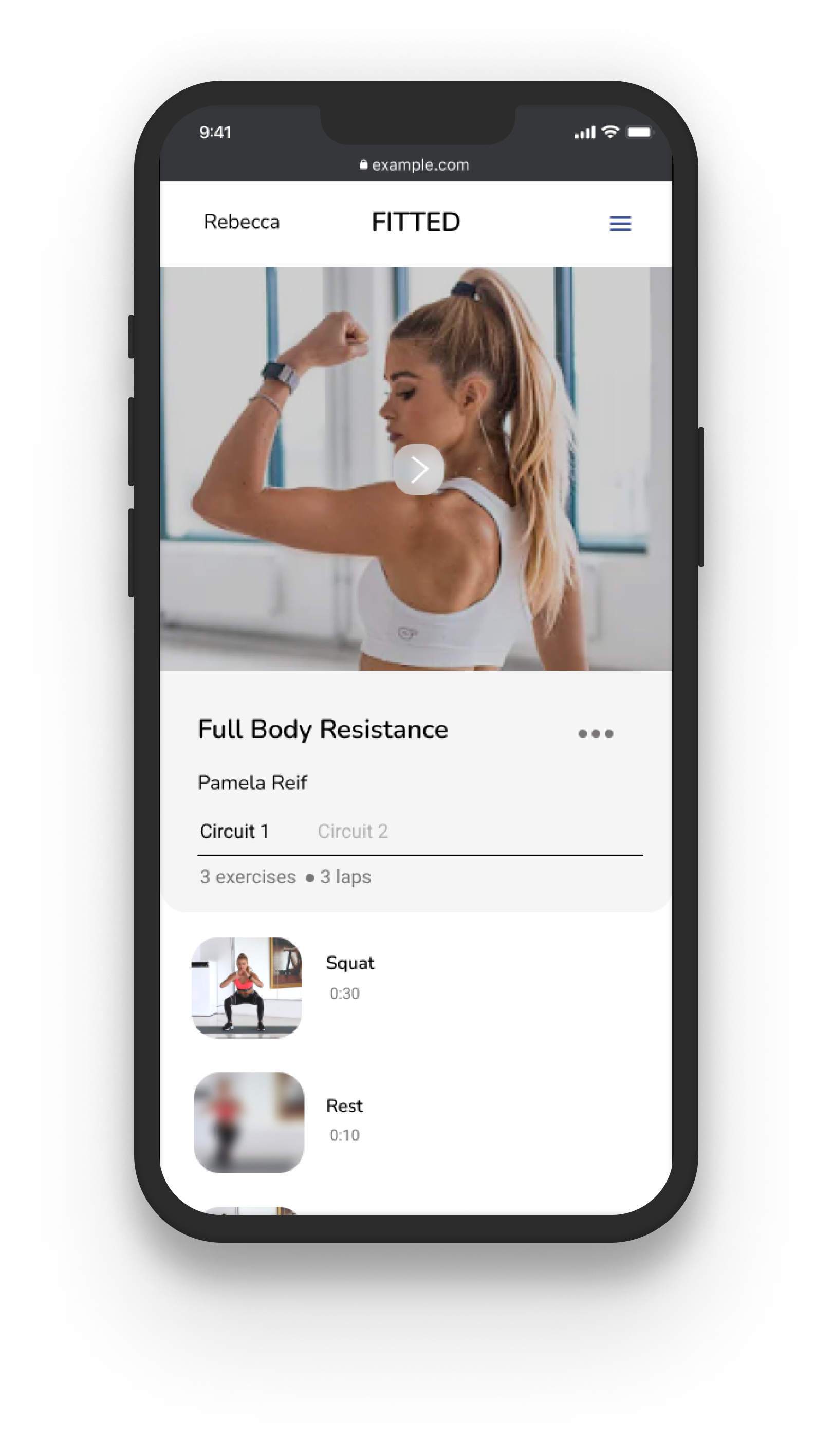
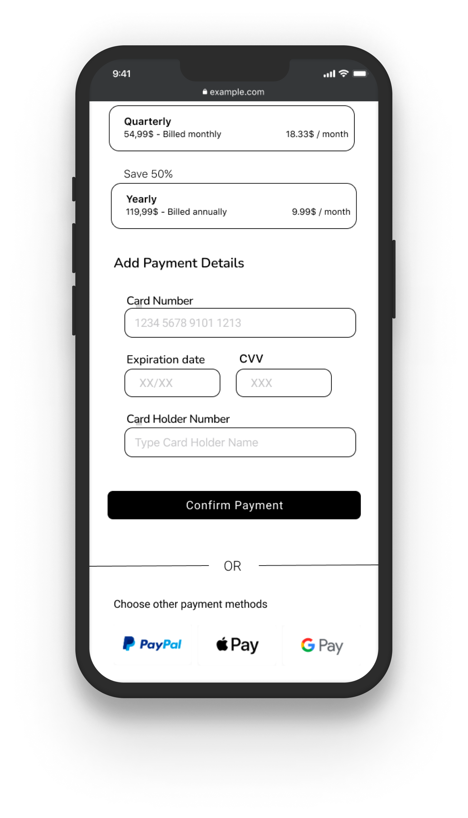
Final High Fidelity Designs
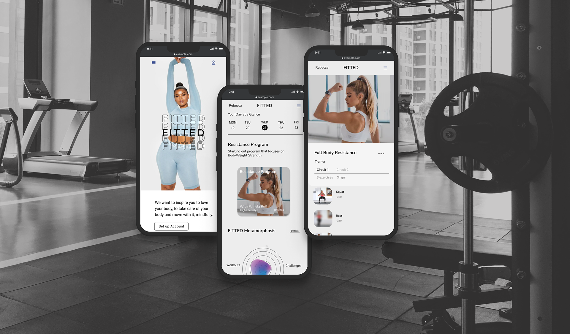


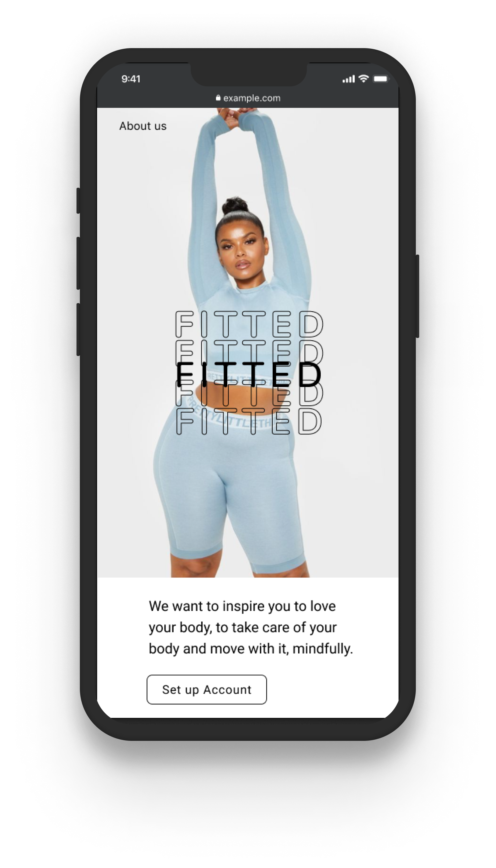
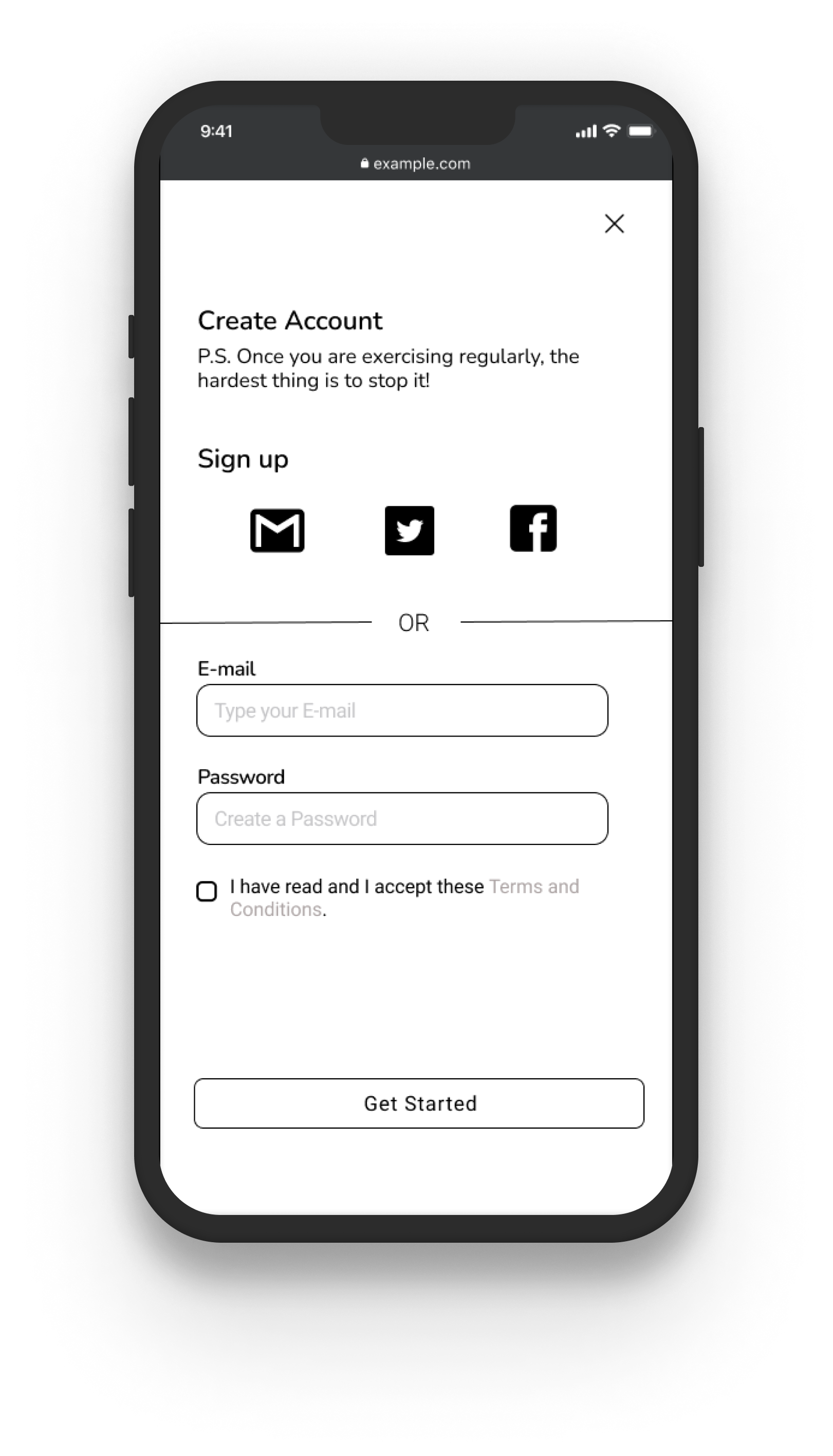
01. Set Up Account
Interesting landing page
The landing page is designed to introduce users to the
features offered once they become members.
features offered once they become members.
Images and gifs are used throughout the page to showcase teasers about the designs and functions of the features.
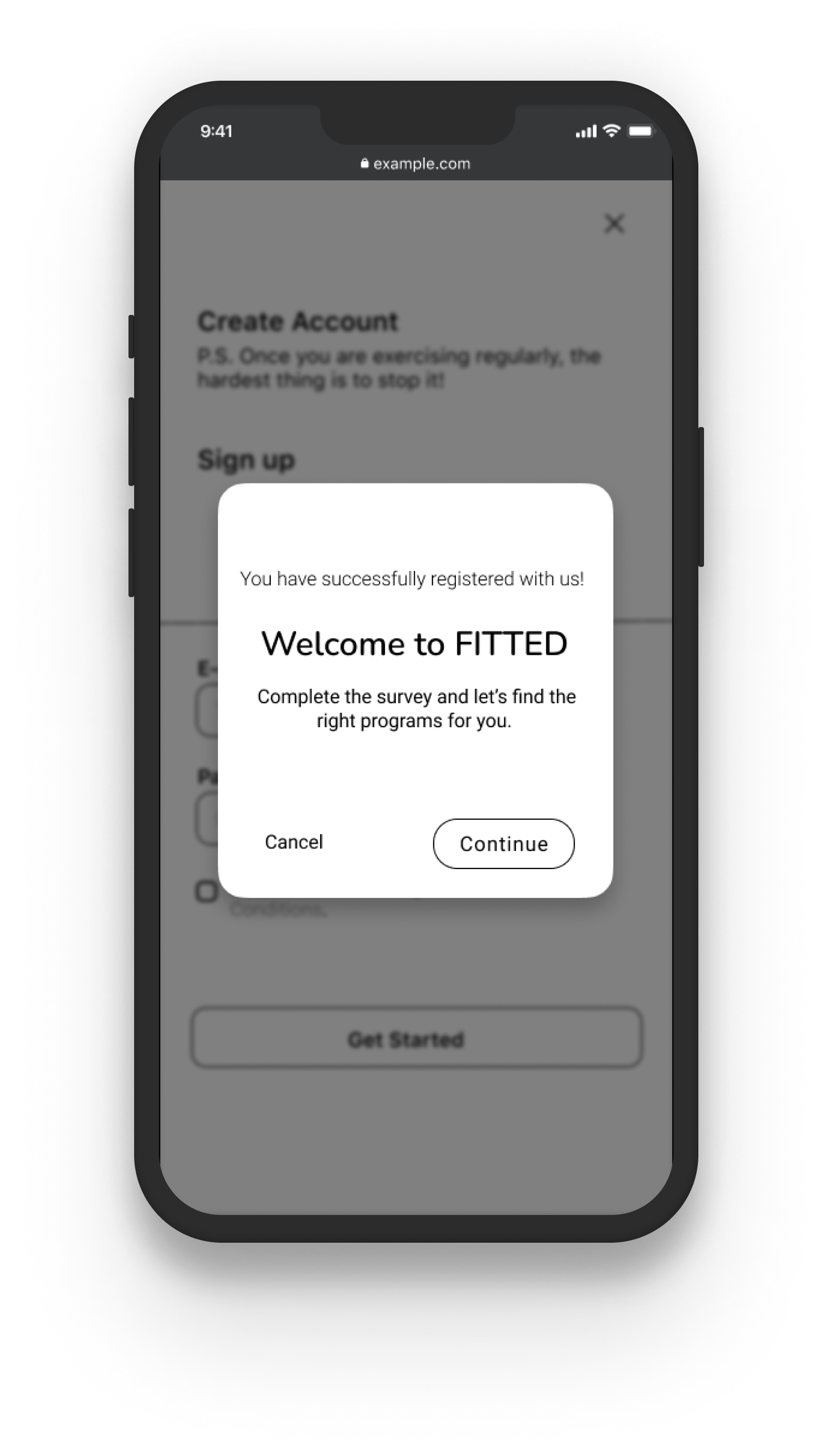
The users are guided to take a fitness test to build their profile and create their account.
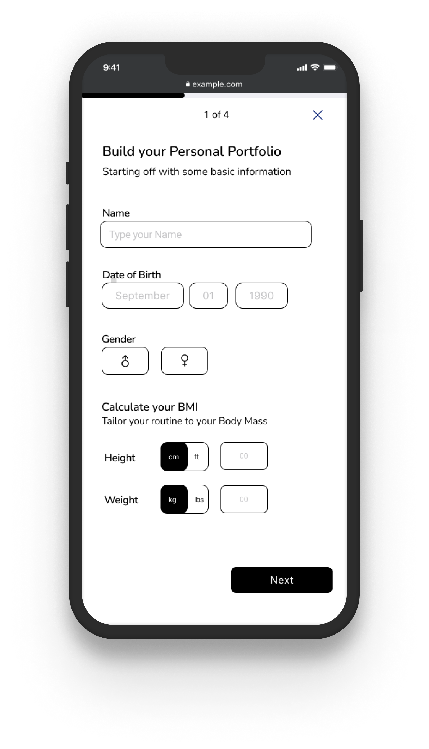
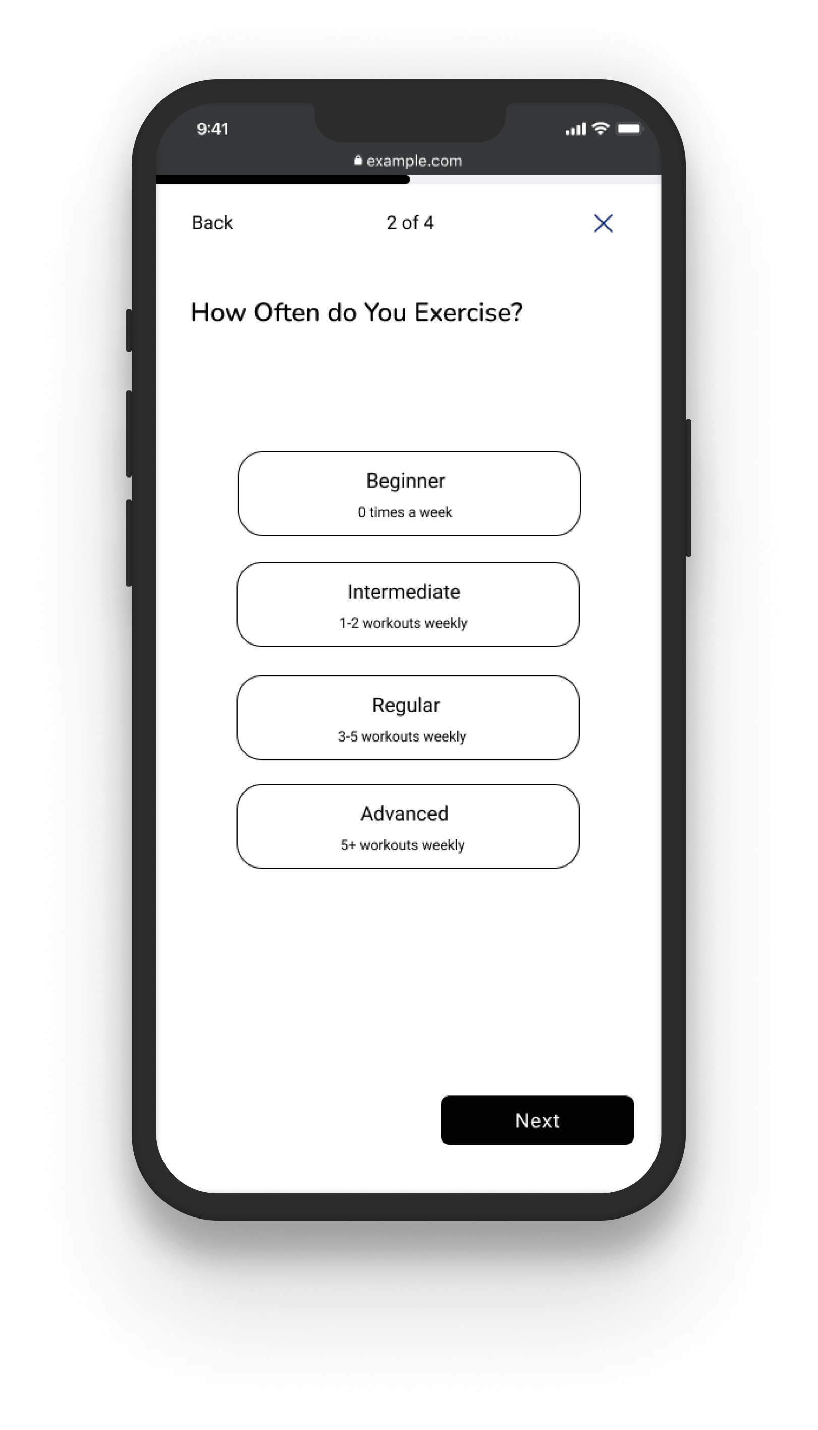
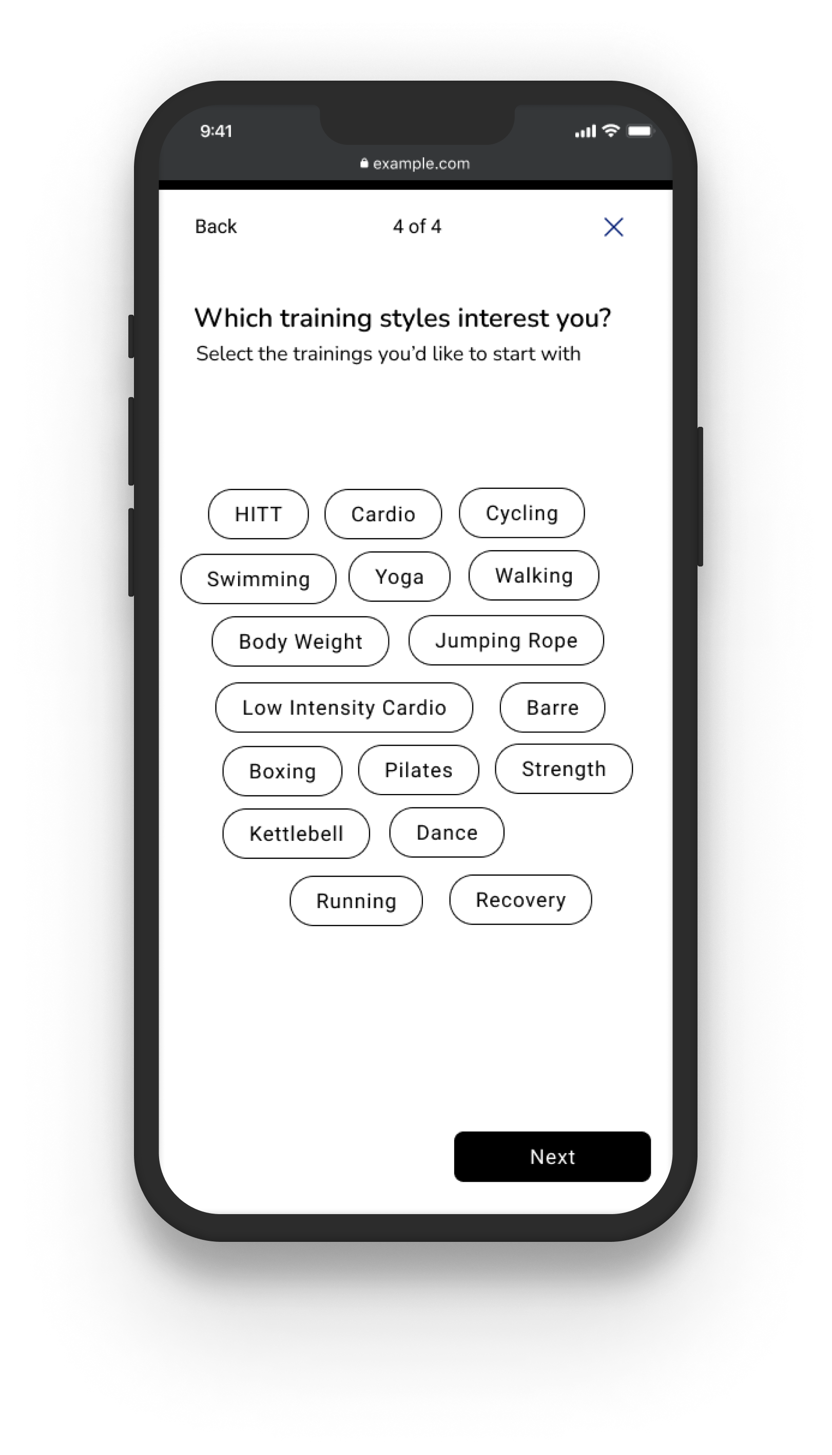
02. Personalize Program
Customized Survey
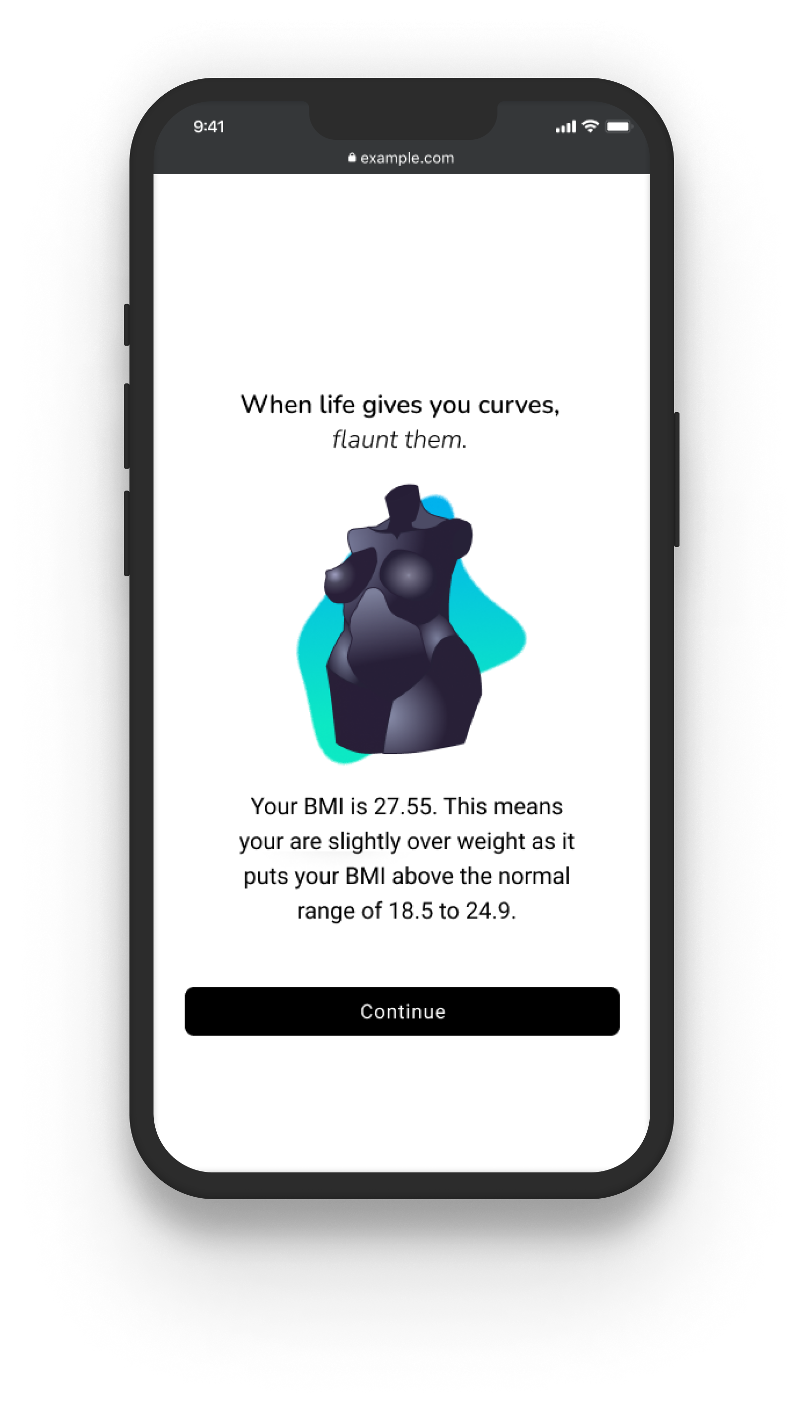
The Fitness test will revolve around 3 main topics: User Profile, Lifestyle and Fitness.
After defining the user's height and weight a beautiful illustration of their torso is designed and will later be altered and re-designed as they lose weight, gain muscles and tone them.


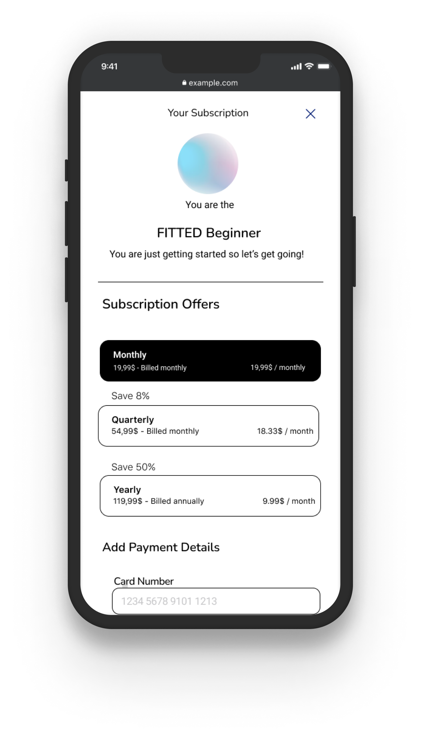
03. Personalize Program
Recommended Plan
Results of the survey will take into consideration the fitness level of the user and their customized recommended program. The page describes what kind of workouts are included, a weekly plan they can adopt and suggestions to equipment they can use to expedite their training.
CTA buttons are set at the end to lead the user to have a set date to start the program or browse the workouts.
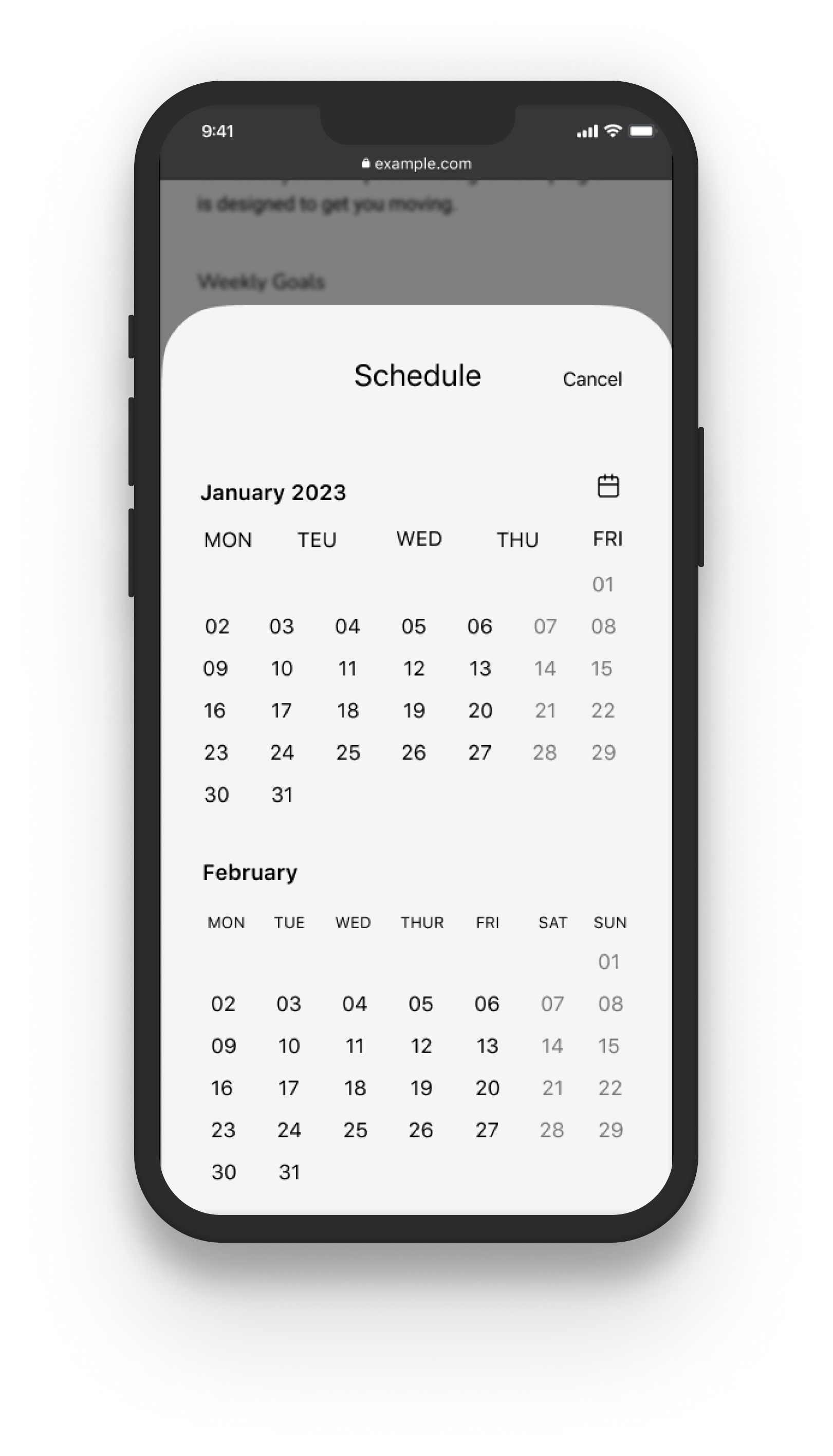
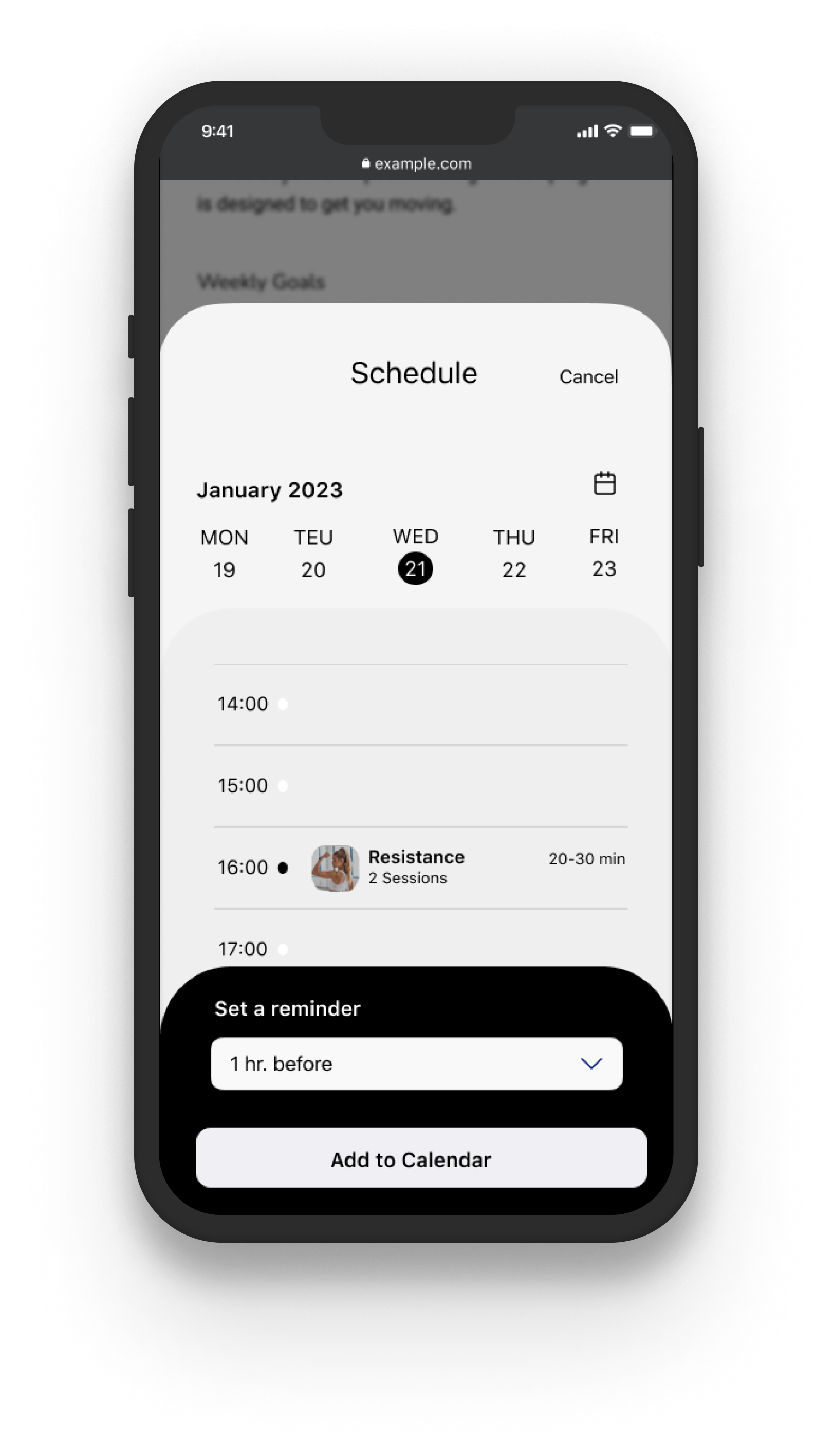
04. Schedule Program
Creative Calendar
The calendar will be an open overlay from the bottom up, once a date is selected two more screens slide upwards to select the hour, set a reminder and add to the calendar. The background is shaded and blurred so users can focus on the pop up message.


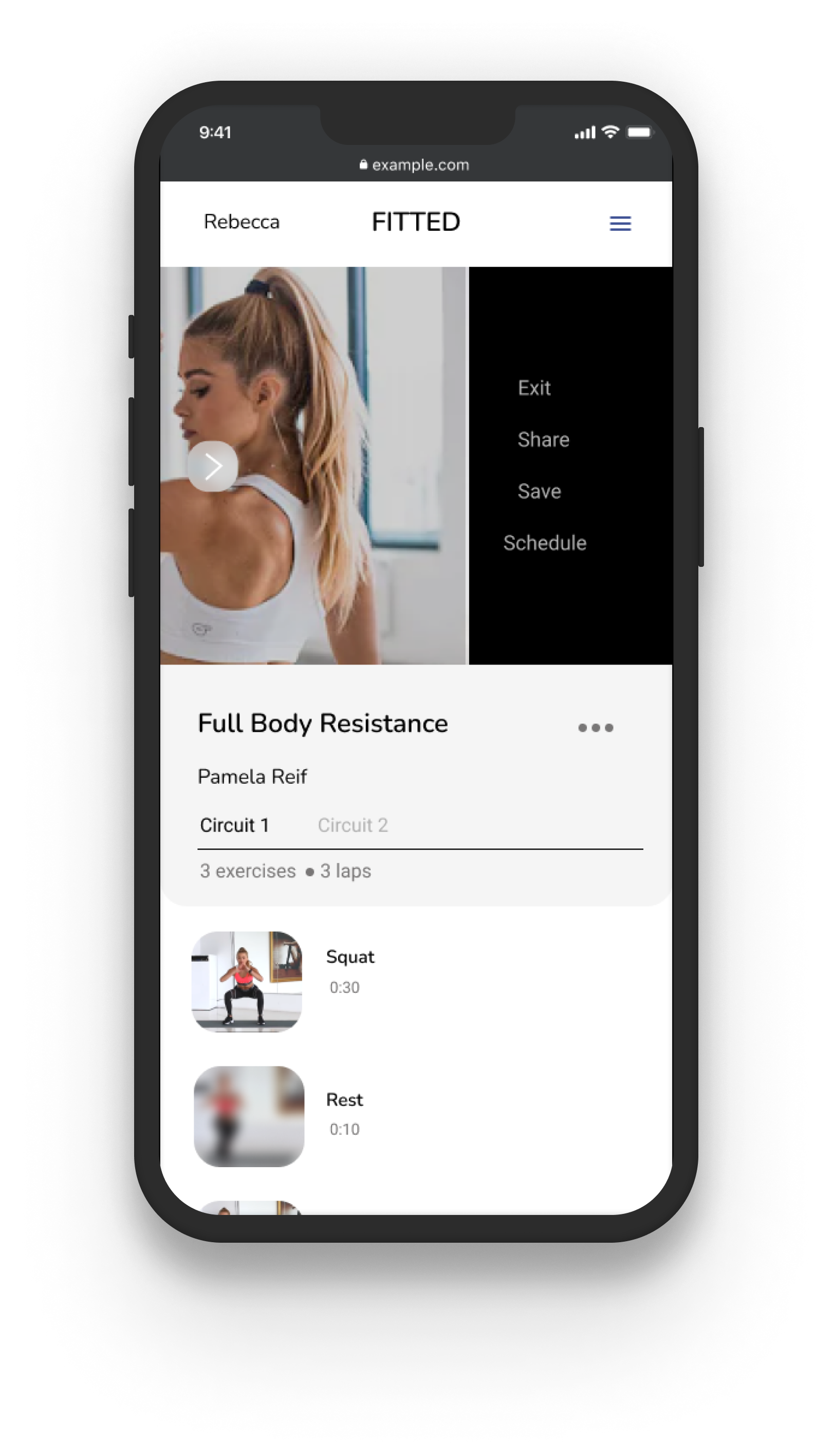
05. Workout Video
Stepwise Workout
As the user is watching a workout video they can track the type of workout they are currently in, how long it'll last and could anticipate the next step.
If they wish to pause, exit, share the video, save it or schedule it for later they can swipe on the video and overlay side menu will pop up and send the user to the corresponding pages they wish to go to.
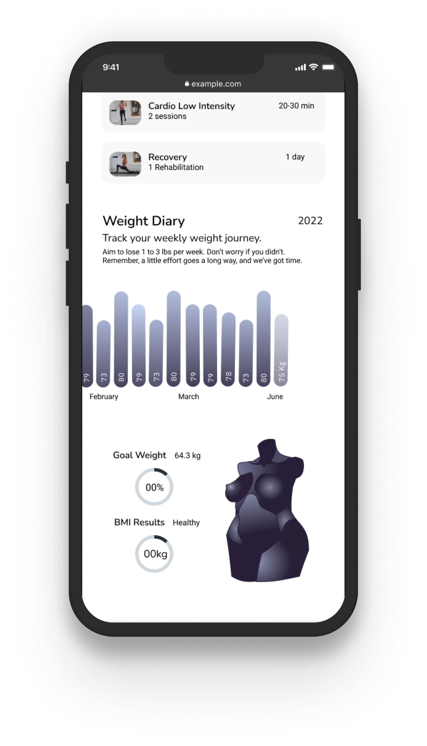
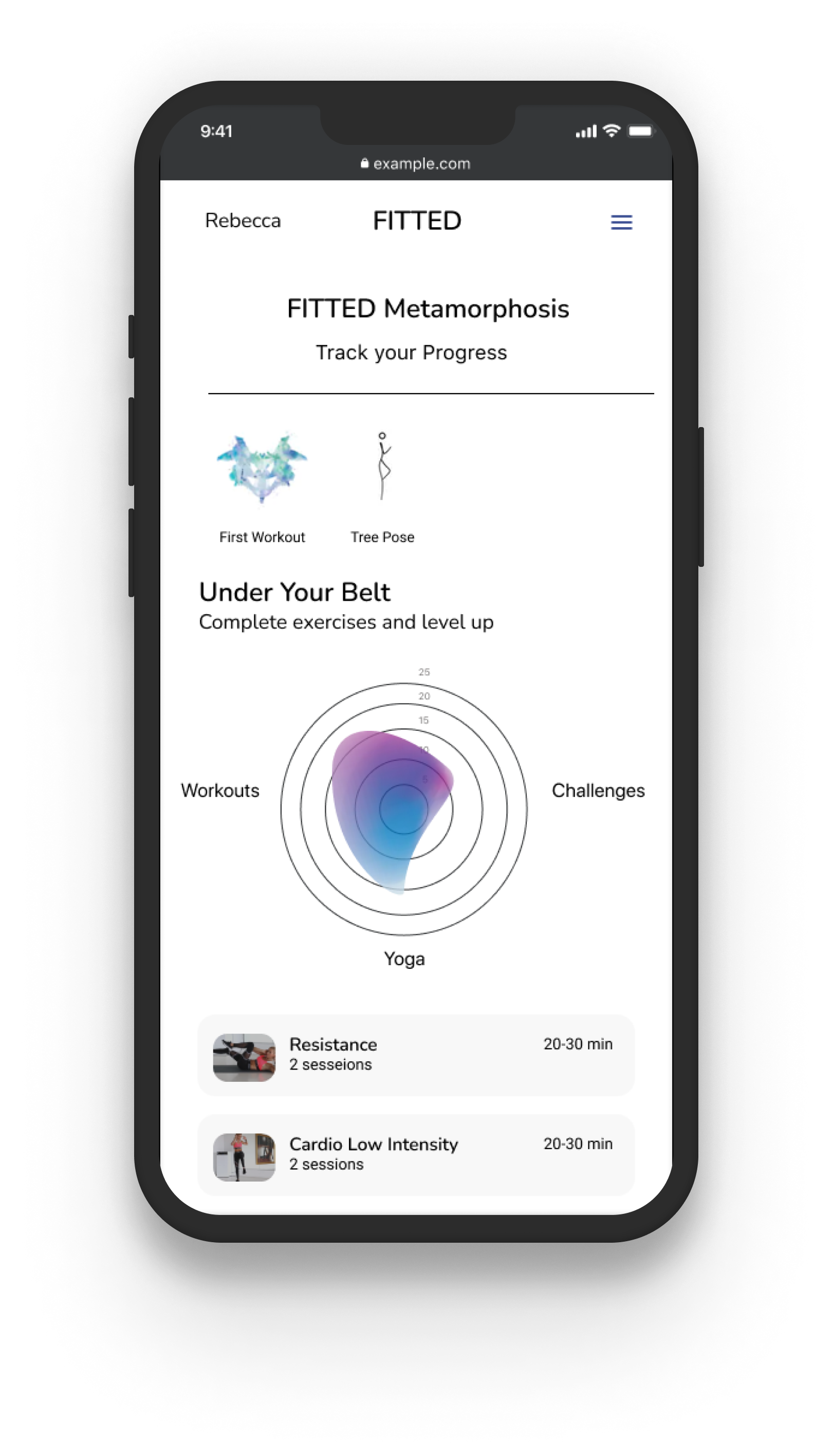
06. Progress Page
FITTED Metamorphosis
the user's progress is presented through a Radar graph that captures the number of workouts, challenges and yoga workouts they completed. A weight diary is also there to track the monthly changes in their weight and body mass. The torso illustration is also included showing off their curves at that point in time.

High Fidelity Wireframes


Special Things
I wanted to create a more tangible way for our members to commemorate their achievements. While digital trophies can be motivating, I had an idea to personalize this moment even further. My solution was to establish a special partnership with other designers and websites.
Special Achievement
Artsy Icons
when a member achieves a challenging yoga pose, they could receive a yoga pose card to redeem in the app, as well as the option to receive the card as a physical poster delivered to their home.
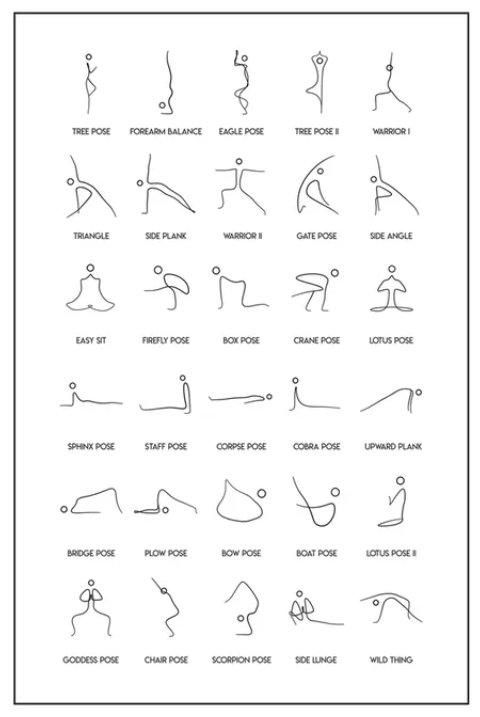
Yoga Poses by Ali Rasheed
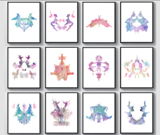
12 Watercolor Rorschach Test Posters from PapaLeoArt
Special Achievement
Artsy Icons
Similarly when a member completes a number of workouts and challenges, they could receive a creative inkblot card to redeem in the app. The inkblot art is inspired by the Rorschach psychology test, aligning with the app's way to connect self-perception and mindfulness to working out.
This idea would benefit everyone involved
01. the member receives a personal gift
02. the artist gains exposure
03. the website promoting the artist receives
increased traffic.
increased traffic.
Style Guide


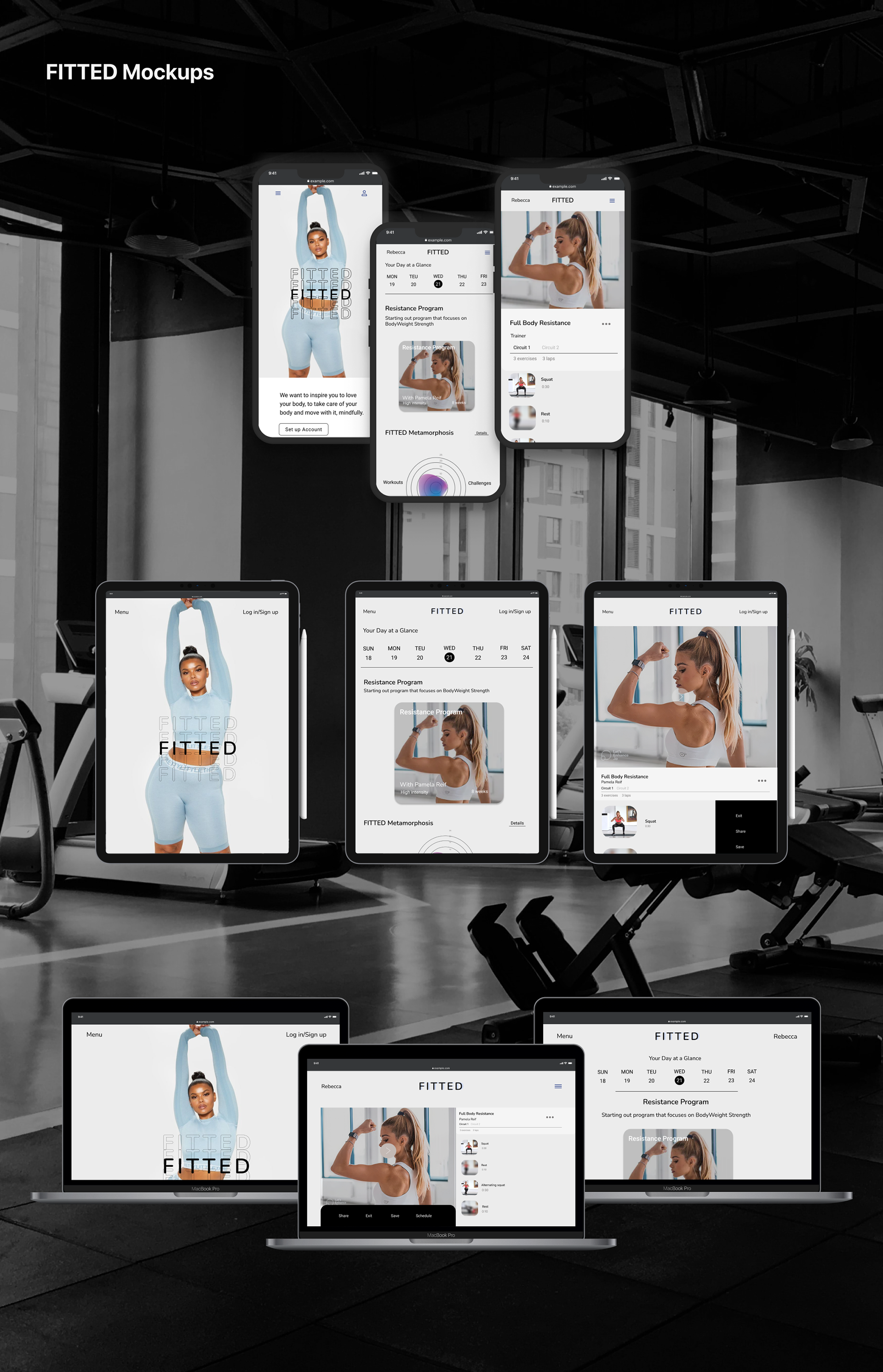
Responsive Design
Reflections
Designing this web app was the most challenging and rewarding project I've undertaken to date. I was able to explore a variety of UI elements, including liquid blob animations, complex overlays, and creative carousels, that I had seen online but had never implemented before. Additionally, I gained a deeper understanding of how benchmark assessments and user research are critical foundations for successful UI design. Moving forward, I plan to refine the style guide for design handoff, ensuring that it includes all necessary items and descriptions.