SAWAH
Introducing SAWAH, inspired by the Arabic word “سواح“ meaning wanderer and the idea of traveling and learning new languages.

Project Overview
Role:
Student UX designer
Student UX designer
The project was a part of the UX design fundamentals course in CareerFoundry and the first UX project designed for low fidelity prototypes.
My role was to conduct competitive and user research, use these insights to build the information architecture and user flow of the app, sketch the wireframes and create low fidelity prototypes to test on potential users and present my design process and solutions.
Tools:
Pen & Paper, Marvel
Pen & Paper, Marvel
Duration:
2 months
2 months
Background:
The project’s objective is to create an app that would empower people to learn new vocabulary.
The project’s objective is to create an app that would empower people to learn new vocabulary.
My Process

Design Thinking
1 Empathize & Define
In the market research, I did a competitor analysis and benchmarking to find out how other companies solve the same problem.
I also conducted user interviews and surveys to understand the needs and motivations of potential users much better.
I also conducted user interviews and surveys to understand the needs and motivations of potential users much better.
2 Ideate & Design
Based on the research, I built the information architecture and user flows of the app, created solution sketches and turned them into low fidelity interactive wireframes.
3 Prototype & Usability Testing
I created a clickable low fidelity prototype to test the solution designs with potential customers in a usability testing using Marvel app to come up with final designs.
Problem Space
Challenges in achieving longer lasting learning experiences. there is a dissonance between achievements in the app and implementation in real life.
It is possible to be entertaining and boring in the same time when it is not flexible enough to cater to people’s own preferences, pace and motivation to study.
Solution Space
“SAWAH” will aim to provide a variety of learning methods based on real-life situations, such as social networking, watching videos, creating flashcards, and playing games.
An app that encourages users to participate more actively and naturally progresses in complexity at their own pace.
Design Direction

Understanding the Market
Approach
The goal is to understand the environment the app will serve and find key opportunities in the market or lack thereof.
Instead of assessing the success factors of Duolingo and Babbel. I wanted to understand what makes other apps lag behind these giants and what do they offer that may be quite innovative yet unknown.
The three apps I chose to assess are LinGo Play, Quizlet and Repetico.
Competitor 1
LinGo Play
Lingo Play allows users to learn words and phrases through flashcards and online games played by single or multiplayer with other app users.
Apps features do not require much instructions, its intuitive and easy to use. On the other hand, the app promises multiple learning methods but this was hidden behind the gaming aspect of the app.
Competitor 2
Quizlet
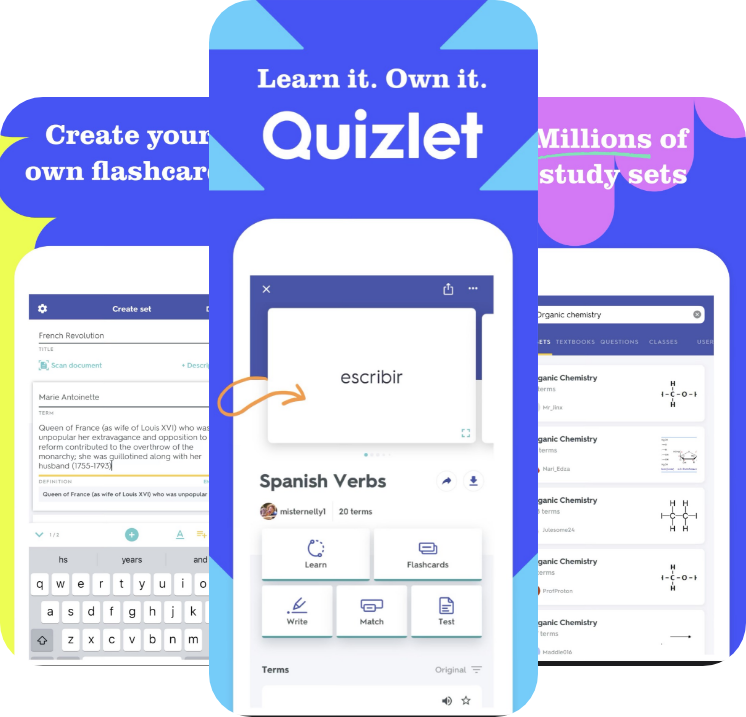
Quizlet allows user to learn the definitions of words, then test their memory through flashcards, picture associations, matching definitions and short quizzes.
Navigation through the app compliments the multiple features with simple, short and intuitive user flows.
Stock images used for word associations differ in quality and size creating inconsistencies. The permanent display of ads can be quite distracting.
Competitor 3
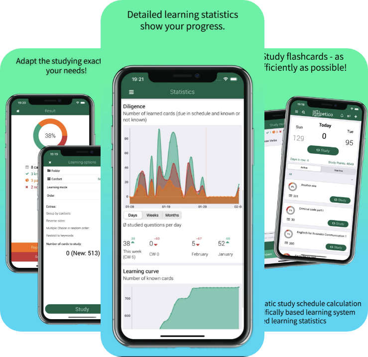
Repetico
Repetico allows users to interact with others by sharing card sets on the app, inviting friends and sending them a link to the card sets they've created.
The icons are universally understood and organized in a way that one page can allow you to link to multiple other pages to complete a task.
The user flow is quite long and strenuous though. It takes a lot of back and forth to complete a task. And the aesthetics is quite industrial and lacked creativity.
Main Takeaways
Competitive Analysis allowed me to better assess what makes a product's design successful or not in terms of meeting the goals of its users. I also explored the way I feel while using the app as a user and brainstormed how I could make it better as a designer.
User Research
In this stage I want to dive into the mindset and environment of the users. The goal is to identify the problem they are facing and brainstorm possible design solutions to solve it.
I drafted a survey and sent it around to 40 candidates and conducted an interview with 4 other candidates. I reviewed the responses of the survey through Monkey Survey and drafted key insights.
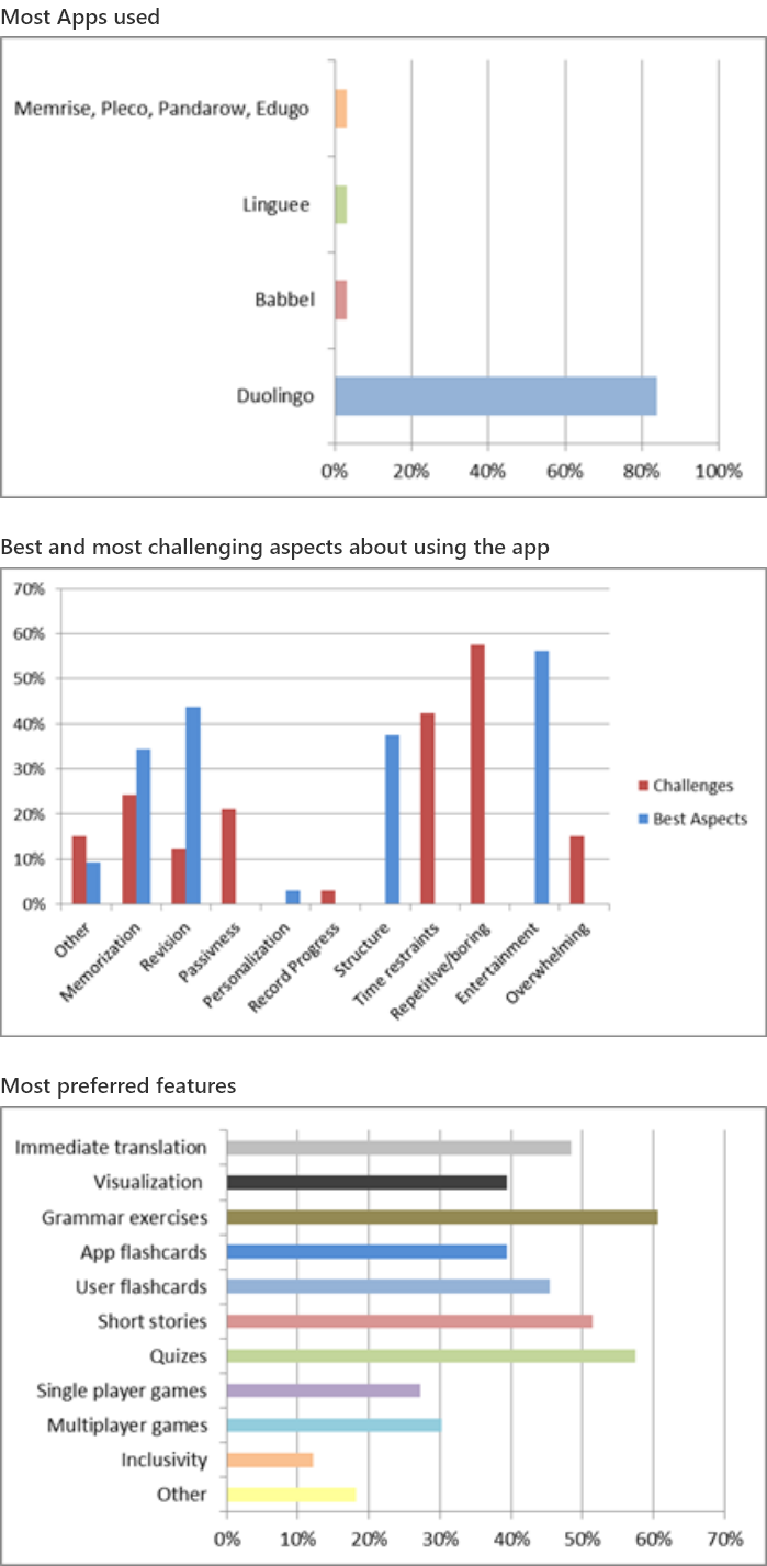
Main Takeaways
Clear structures of the learning method and an entertainment aspect stimulates the memory.
However, implementation of what is learned and long term memory is the biggest challenge in learning through an app.
Personalization is an aspect that requires a bit more attention.
As much as apps provide reminders, it is quite easy to ignore the notifications and stick to the intended scheduling.
Gamification only catches the attention of users at first but is not the main element that keeps them motivated.
Interview Analysis
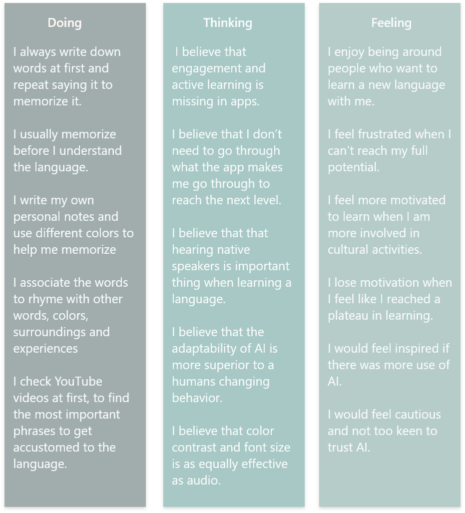
I listened to the recordings of the interviews and reviewed my notes to organize the interviewees’ comments into ‘Doing’, ‘Thinking’ and ‘Feeling’ statements.
Main Takeaways
How might we design a vocabulary app that is
intuitive to and evolving with the individual’s
surrounding to achieve a longer lasting learning
experience?
intuitive to and evolving with the individual’s
surrounding to achieve a longer lasting learning
experience?
The interviewees want an app that provides more accessibility and adaptability to the pace of the user's progress and introduce new ways of learning the language.
Understanding the Problem
Using the insights of the user surveys and interviews I created an original proto-persona to represent of the goals, pain points, and behaviors of a hypothesized subset of users. This will help me stay focused on the purpose of my design.
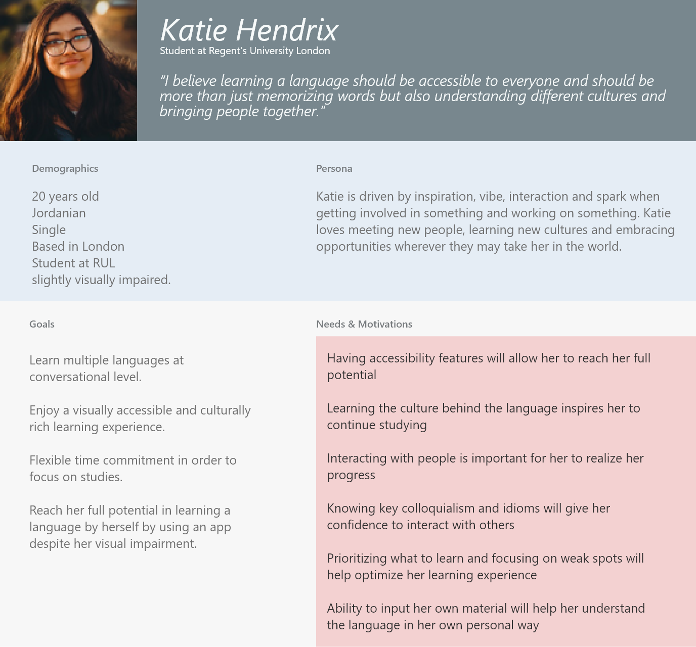
Primary Persona
Problem Statement
Katie needs her vocabulary learning experience to be more accessible, inspired, intuitive and short to be completed "on the fly" each day. We will know that to be true when Katie continues to use the app after the initial set up and manages to move through a large portion of the content.
Hypothesis
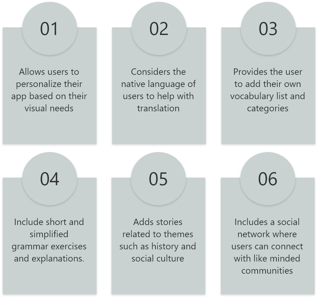
I believe that by creating an app that will apply the features below I can achieve a longer lasting learning experience for Katie that can be life changing and memorable.
Information Architecture
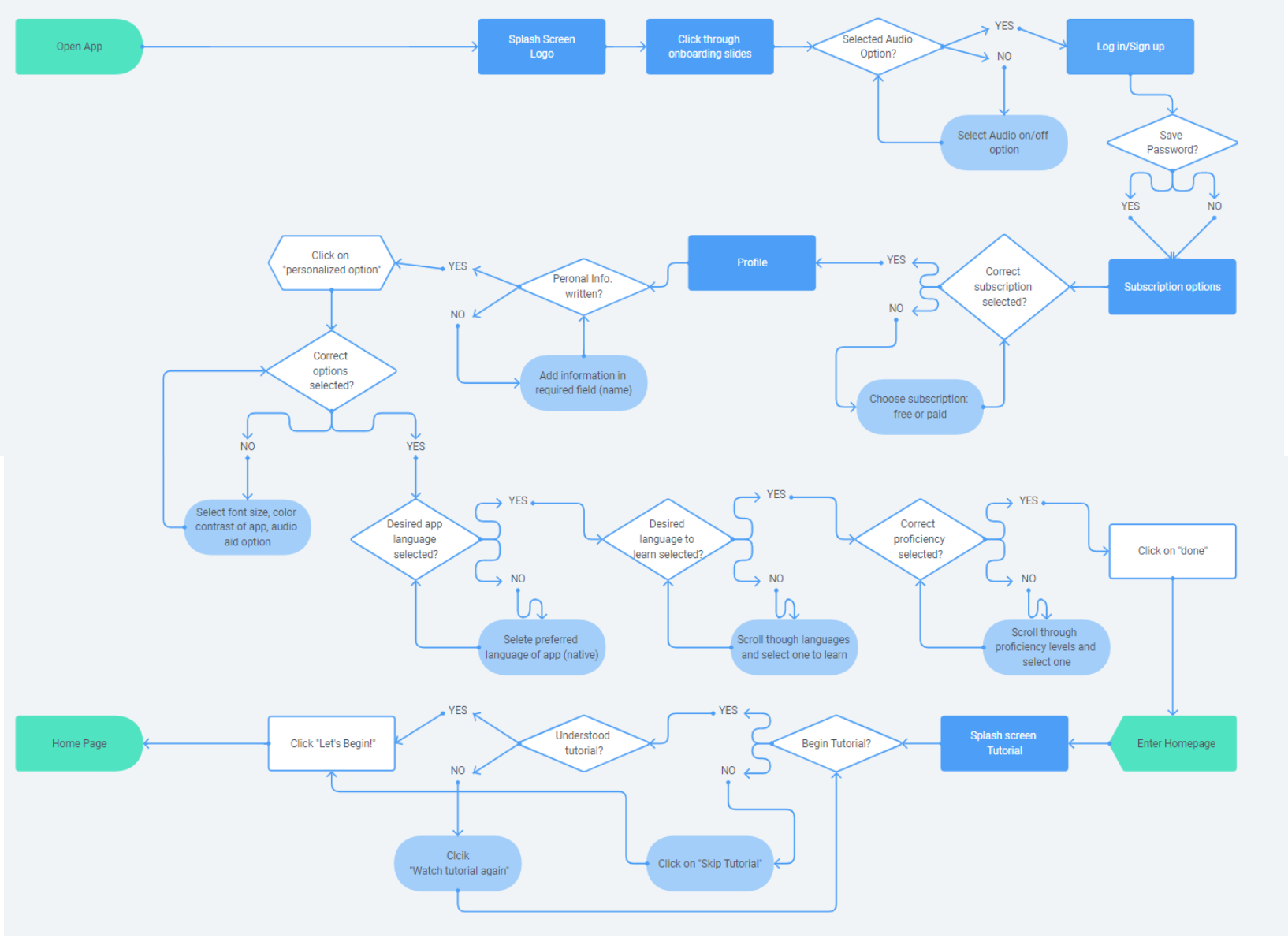
I created user flows that will define the main tasks my persona will need to complete to accomplish her goals and visualize how we expect our persona to move through the information space of the application.
User Flow #1: New User Builds Profile
Entry Point: Open App
Success Criteria: Build Profile and create personalized experiences
Success Criteria: Build Profile and create personalized experiences
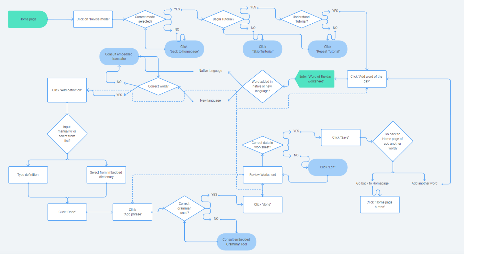
User Flow #2: New User Uploads New Word
Entry Point: Home Screen
Success Criteria: Learn new vocabulary and phrase to be used in real life.
Success Criteria: Learn new vocabulary and phrase to be used in real life.
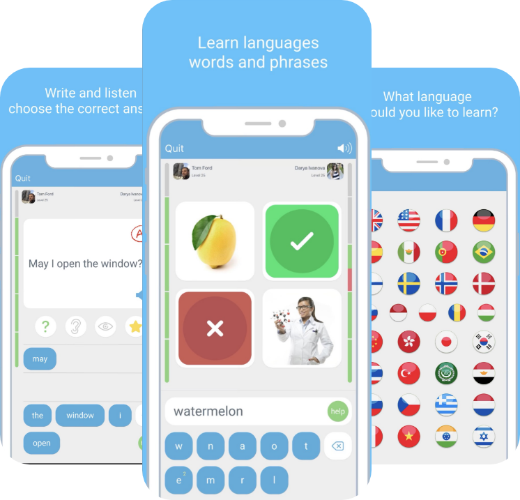
Wireframing & Prototyping
I drew initial sketches of SAWAH to create low-fidelity wireframes. I collated the wireframes and made a clickable prototype using the online tool Marvel.
Onboarding Screens

Create Flashcard Screens
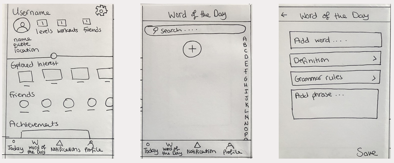
Study Mode: Learn Words & Phrases
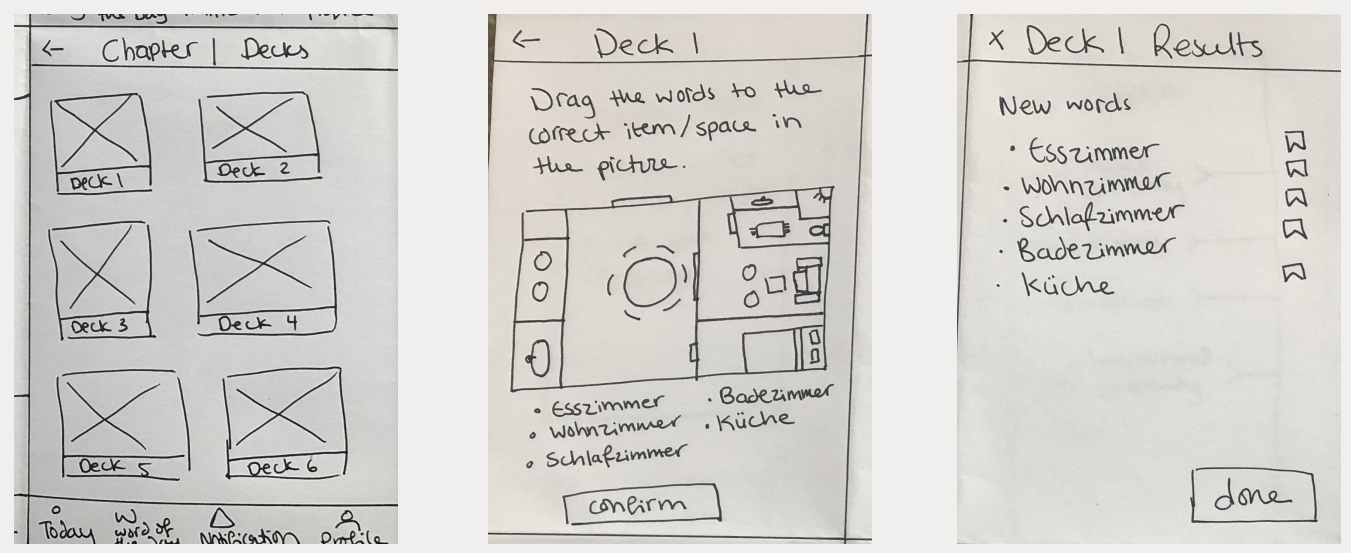
Revise Mode: Play Games
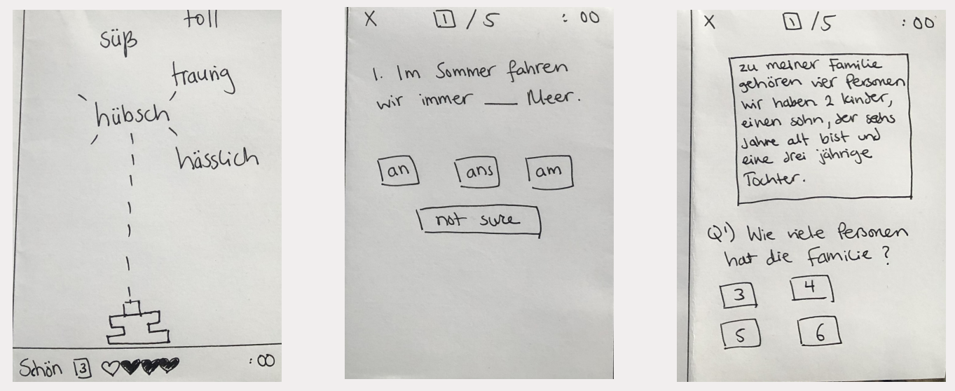
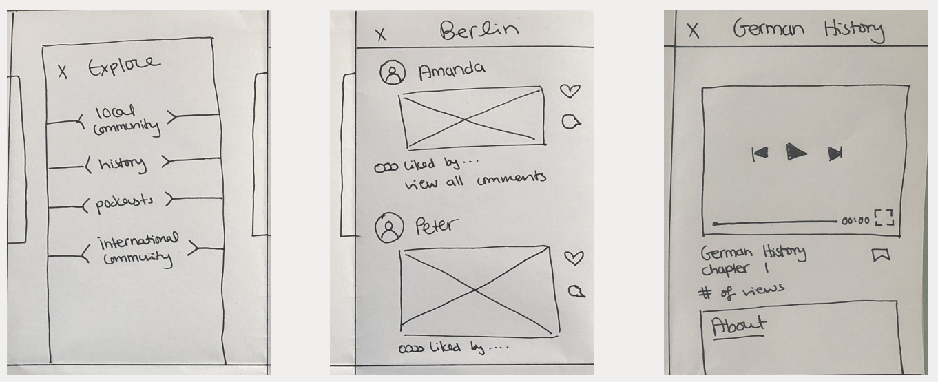
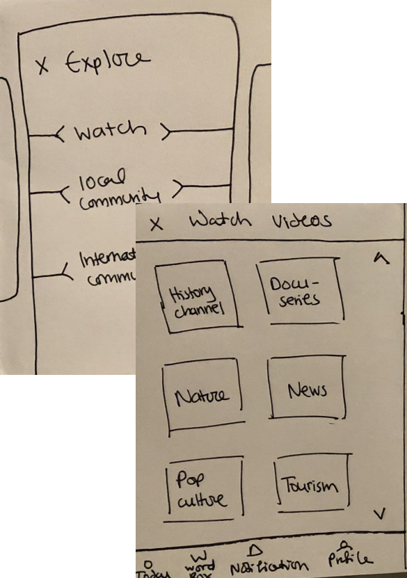
Explore Mode: Explore culture, news and communities
Usability Testing
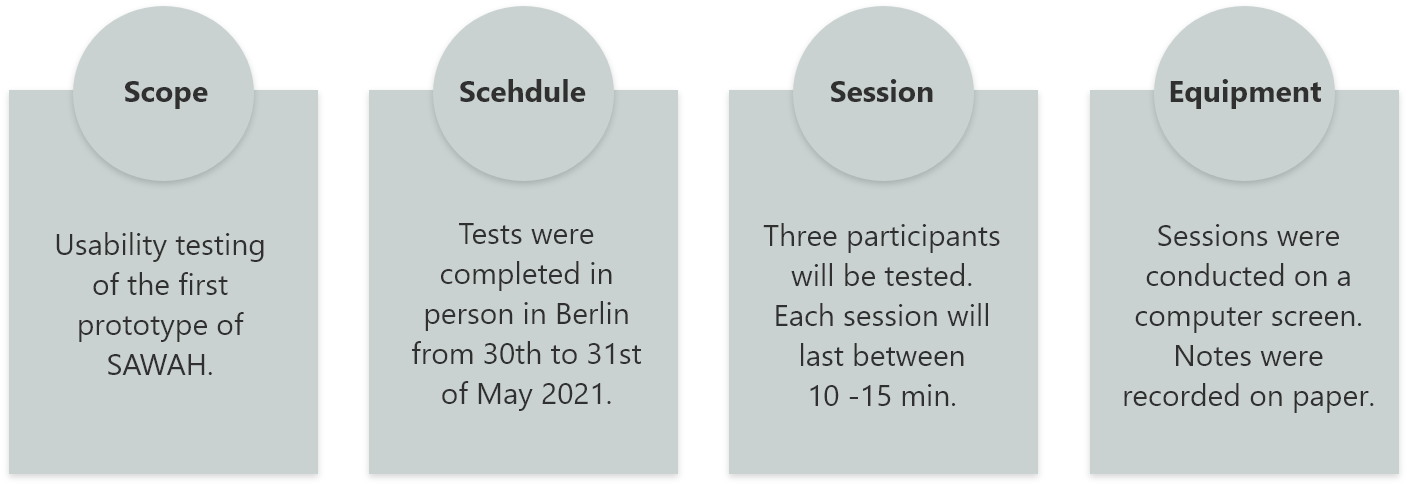
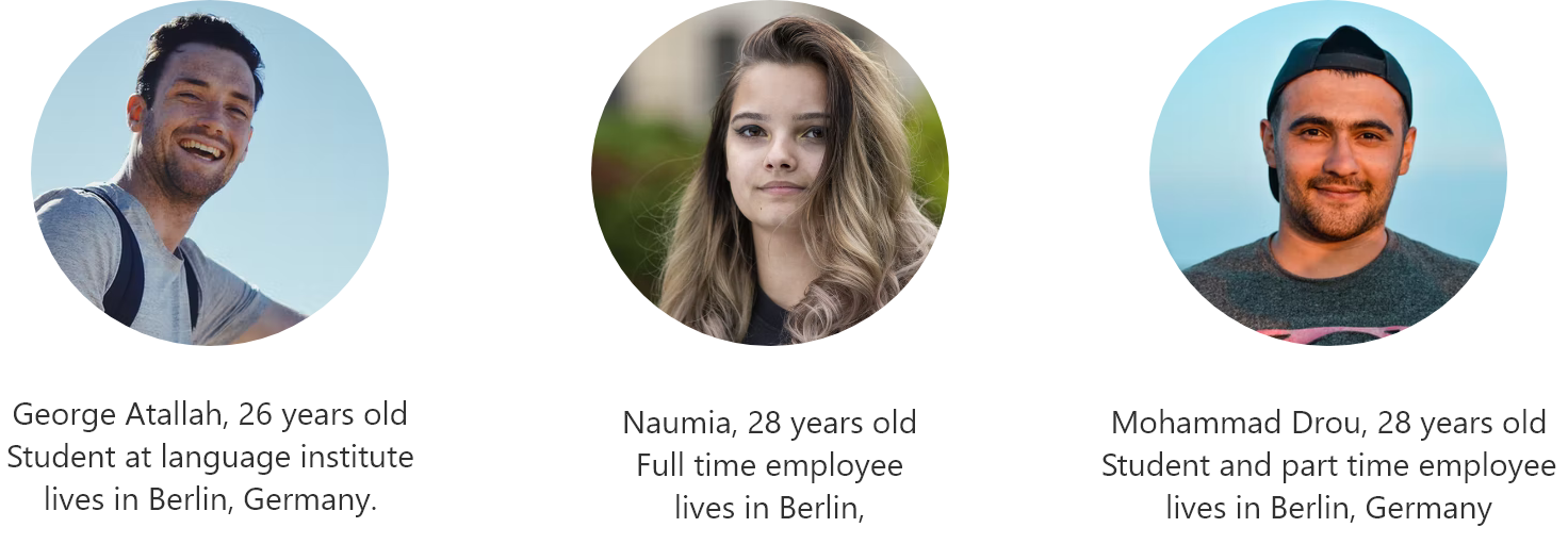
Participants
Scenario Tasks
I asked the participants to complete 6 scenario tasks and I recorded their comments. I wanted to see how they interact with the app's designs, do they intuitively navigate through the pages? what issues have they faced? what caught their attention?

Task Analysis
I summarized the participants’ comments into observations in a usability test report. I gave each observation a severity rating based on Jacob Nielsen’s scale and came up with recommendations to solve the issues.
Main Takeaways
How might we design a vocabulary app that is
intuitive and evolving with the individual’s
surrounding to achieve a longer lasting learning
experience?
intuitive and evolving with the individual’s
surrounding to achieve a longer lasting learning
experience?
The interviewees want an app that provides more accessibility and adaptability to the pace of the user's progress and introduce new ways of learning the language.
Prototype Improvements
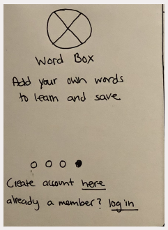
Onboarding Screen
• Allow users to skip onboarding and sign up or log in.
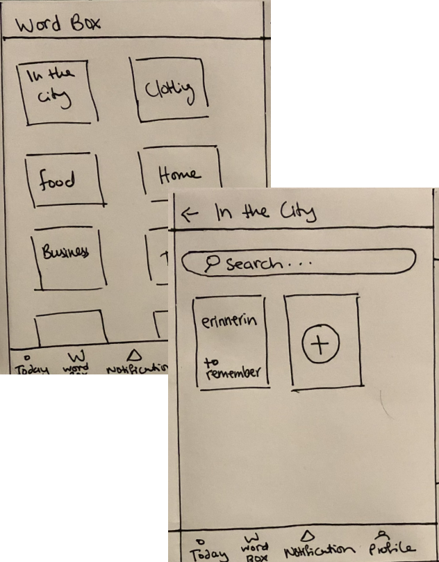
• Replace ‘Word of the day’ to ‘Word Box’ for a better wording to explain to the users that they can add new vocabulary word
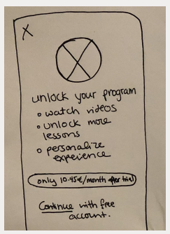
Subscription Screen
• Further motivate users by creating a distinction between free account and paid account rather than just having a "free trial".
Create Flashcard Screens
• Design new pages for the option to save words in themed decks in addition to the alphabetically ordered list. This option can be changed through setting and ‘personalization option’ as listed during onboarding.
• Add definition of word to enable user to search and see the word in both the learning language and their spoken language.
Watch Videos Screens
• Replace ‘history’ option with ‘watch’ to provide a list of different topics that the user can then choose from
• Add a scroll bar to click through videos for selection and the videos can auto play once the video begins.
• Remove podcast feature for now.
Low Fidelity Prototype
Explore the Apps' features designed at low fidelity mockups turned to interactive prototypes via MavelApp.
Future Iterations
My next step will be to create a high-fidelity prototype of SAWAH and test that version on potential users. I will include explanations to proficiency level so users can relate more to the level they are in and select the closest description to their level.
I will add an option to learn more that one language during onboarding. I will also add ranking and reward system for games. I would Introduce an action to click on word in exercise phrase to read definition on the spot and save.